Friday, April 30, 2010

Slave Leia Portrait 01


3rd in this test series is Slave Leia...of course, I would be remiss to not include this incarnation, right? This is the sketch warm-up, the hair is kind of rushed, and I lost a bit of the likeness...


...so I spent a little more time on the transfer drawing, capturing her eyes better, and the thinness/angles of her upper lip, the two most lacking likeness elements from the sketch.


With some spatter and fill with the black paint, she was ready for the airbrush...

Thursday, April 29, 2010

Endor Leia Portrait 02


Damn me and this too dark canvas prime! Again the pencils and paint mixed well, but the darkness of the prime just kills the saturation. And I'll bitch about it again in the other Leia's coming up, I'm sure...


So despite the darkness/desaturation, I managed to pull some life out of it with the pencils, and I like how the cast shadow mixes with the roll shadow around her eyes, and around the chin strap. That was the main thrust to do this particular image, so I think it was lesson well learned.


With just a bit a dark brown airbrush to smooth out the darks a bit, and a couple spots with white...done! I'll give it a B, with marks off for the dark primer, and I missed an opportunity to add some texture to the leather with that water reduction technique - that wasn't the point of the exercise, but I should have done it to practice...in the very least, it would have made it more dynamic, I think.

Wednesday, April 28, 2010

Endor Leia Portrait 01


This one is a bit of a cheat, in that I feel I have a pretty good handle on hard surfaces, so I chose this image of Leia with the helmet - I'm still kind of sucky at hair, all my drawing and digital tricks aren't translating very well! - but I did want to try some cast shadows. So again, I started with the 1:1 sketch with the col-erase layout pencil.


And again, I used a few colored pencils to build of the forms that I didn't want too heavy with black...


...and after I put in the darks with black paint and spatter, I went back with a dark brown prismacolor to darken the leather straps of the helmet.

Prepped, and ready for paint!

Tuesday, April 27, 2010

Hoth Leia Portrait 02


With the drawing set, I went ahead and broke out the colors. I was really happy with how the under drawing with the colored pencils blended with the paint, but I could tell already that the prime gray was about 15-20% too dark...


...so when it came time to start the pencil work, I thought that it may be a problem with muddying up the highlights, just trying to get the contrast up to a certain level. And it did happen in certain areas, notably in the right forehead and cheek area.


Here's the final, with some airbrushing of white and black to push the contrast a bit more, and some touches of white in the eyes and hair.

Overall I give it a B, the too-dark prime was obviously a big problem for the color rendering, and the hair looks less than it did in the b/w pencil drawing. At 5x7", it's just OK as a stand alone, but probably in a group portrait, it might come across better? And I managed to maintain a pretty good likeness of Fisher/Organa from beginning to end.

But I confirmed some suspicions about the pencil rendering before paint, so lesson learned, and it's something I'll continue to do as I move forward.

Monday, April 26, 2010

Hoth Leia Portrait 01

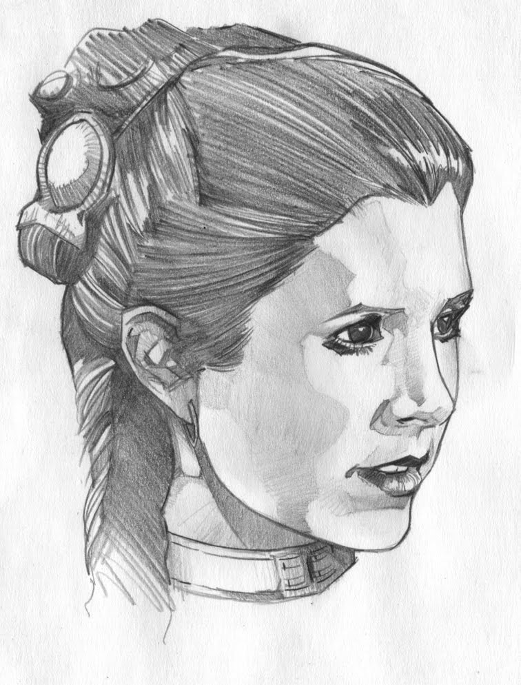
All right, one more round of paint tests before I get really serious. I still need to work on portraits, and with the less than overwhelming Han and Leia piece, I go back to Star Wars for inspiration.


And again I wanted to just do a drawing to get familiar with the details before starting the final, this is just a black Col-Erase layout pencil on some drawing paper.


I went back to a gray primer, (instead of the warmer primer I did for the H&L test) but I think it got a little too dark. As I'm quartering of the page for four tests, they might suffer a little due to the darkness, but maybe I can turn that into an advantage? Anyway, the size of these is around 5 inches high.

Instead of just using the dark HB pencil, I'm using some prismacolor pencils to define the form of the face and hair - browns, oranges, yellows and reds, and other areas I want a bit more softer, like her white Hoth outfit: I'm using browns and warm grays for that.


Just a touch of black paint for the really dark parts, and a bit of texturing, it's finally ready for some airbrush paint...

Friday, April 23, 2010

Middle America Tour 2010


And here's the last one for 2010...so far. Robb and Elissa from TPR like this old one so much, they asked me to re-purpose it for this year's tour through the same general areas of the U.S.


St. Louis was going to be a stop along the way, so Robb suggested I replace the track with an approximation of the St. Louis Arch, and I made a few other adjustments to differentiate it from the original design, primarily flipping the line art and recoloring it.


And of course, the shirt front tag.

Well, that's it for this year, have fun on those tours, everybody!

To find out more about these worldwide theme park tours, go to: www.themeparkreview.com

Thursday, April 22, 2010

Theme Park Review - IntimidaTour 2010 Final


Vroooom! And here is the final for the IntimidaTour shirt design. I used an appropriation of the ride logo, and copied and stretched the 'I' to make the capital 'T', and used the font for the 'Earnhardt 3' for the numbers and the chevroned TPR, then usual for the locations.*


And of course, the all important tag for the shirt front.

To find out more about these worldwide theme park tours, go to: www.themeparkreview.com

*At the time this design was turned in, Kings Island and Camden Park were NOT confirmed. There's an alternate design that deletes those two tour stops, just in case.