Tuesday, December 23, 2008

Merry Christmas!


I hate to be one of those bloggers who just disappear, but man...I got overwhelmed with juggling projects, general end-of-the-year stuff, trying to get everybody's presents, and get ready for vacation, which I am now officially on!

At least I left something cool up on the post for awhile...over on Siebertron.com they now have a video of that little guy transforming, and his name (thank the stars of Cybertron!) may NOT be Dirt Boss, but Scrapper - way cooler.

I got called back onto the TF2 game, doing something so cool that it kills me I have to wait until May to show the stuff I'm working on. I'll just say TF fans are going to be happy! But that means I'll be working all kinds of overtime, so posting might be spotty in January, expect a lot of sketchbook art and...gulp...Hannah Montana art. Ahem.

Merry Christmas and Happy Holidays, everyone!

Friday, December 12, 2008

Forklift Drone!


Dude...I am so happy to see this on Siebertron.com today.


I was sooo disappointed that this character didn't get a figure last time around. He was my favorite drone of the seven I designed, all that's left is the Mixer Truck, and then all my drones will toys. And I tell you now, if they make my Triple Changer Shockwave, AND call him Shockwave, my head will explode with glee.

Now I realize these guys don't fit in the movie canon, but I started working on these guys long before the movie concepts were final, Hasbro was very happy with our submissions for approval, so we kept going. We started off with a little guy (Forklift) and medium guy, (Car/Swindle) and a bigger guy, (Truck/Dropkick). Hasbro liked them so they ordered more. You can see the evolution of the characters complexity beginning with Swindle, and ending with Shockwave, about the time the concepts from the movie were handed off to ILM, who continued refining the characters even more.

So, in the end, they didn't match, but I'm happy to say I'm working on the TF2 game, and this next set of game characters I've been working on should match up pretty well. And even I don't know what the toys who/what/look like at this point. So don't ask!

Doodles from last night.


Just fooling around...I must be the last commercial artist to take a crack at the new Joker.

Thursday, December 11, 2008

Topps Two


So I came back with these, much more economical sketches to get approved...and I've not heard back!

So I guess I won't be doing them after all?

Wednesday, December 10, 2008

Submission for Topps


I was wondering about doing some sketch cards, so got a contact, and whipped up these sketches for a test submission.

I got accepted, but they pay so little, I doubt I'll be able to make time for it, but we'll see...

*the sizes are 2.5 inches X 3.5 inches - regular card size.

Tuesday, December 9, 2008

War Machine - V2 Final


So here it is, something good enough to get posted for critiques. Still a little over designed; too many segments, but this where another artist could take a refining pass to keep the idea fresh until a final gets picked. Hypothetically.

So that's my big idea for War Machine, Rhodey's humvee to Stark's sports car.

Monday, December 8, 2008

War Machine - V2


Here's the shape block-ins. Minimal shading and detail, color correction, etc.

Now on to the final pass, shoring up a few areas, adding seams and mechanical bits, graphics, shadows - you know the drill.

Friday, December 5, 2008

War Machine - Revisited 04


War Machine - Deployed.

So that's why he's got these big wing things on his back;

1. Break up the silhouette between WM and Iron Man.
2. House concealed large weapons.
3. Additional power routing, to make him more powerful than the Mark III suit.

And this is the big idea that never really got finished last summer, after being all inspired right after seeing the movie.

.

Now I show this to the Art Director here at Bad Flip, and he whips out his red pen, indicating reworks.

These arms and legs don't match the rest of the design, things would knock into each other, limiting movement, and the the stance is a little wonky, weird twists below the knee...needs another pass.

So expect War Machine V2, something good enough to get on the BFP website...

Thursday, December 4, 2008

War Machine - Revisited 03


Here's the colored version, with details and additional graphics.

You'll notice that it says 'Undeployed.'

Wednesday, December 3, 2008

War Machine - Revisited 02


And here is a nearly fully realized grayscale of the design. I added in more seams that weren't in the original drawing, and other bits and pieces of 'tightening' to up the ante a bit. Now on to color and additional details.

Tuesday, December 2, 2008

War Machine - Revisited 01


All right. Every time I look at that last one, I like it less and less. So here is a work in progress, a polished version of that final. This is the first pass, to recreate all that was in the original, with a few revisions as I go...

This is purely a portfolio piece, I have months of Transformers work I can't show until summertime, but I need some higher end stuff to get work now!

Monday, December 1, 2008

Cyclops Steam Punk


This is a design by Adi Granov, for a story by Warren Ellis for Astonishing X-Men : Ghost Boxes #1. It's Steampunk X-Men, and it's awesome.

I like everything about Cyclops, but to me it seems no one has really nailed an iconic look for him. But this design is so cool, and perfect for the story, I got a little inspired!

Wednesday, November 26, 2008

Bond Week! 007


Here's the last one. The only Quantum of Solace background I had a chance to do, the Sewers of Siena. You can see there was a lot of work to get it from the test geometry to what the AD wanted to see, but it was a lot of fun. Again, tons of atmosphere and mysterious lighting to help sell the ideas.

I want to thank Manny Salazar at Treyarch for the opportunity to do these backgrounds, he was great to work with!

All right, that's is for me this week. I'm minutes away from leaving town to go eat Turkey!

Tuesday, November 25, 2008

Bond Week! 06

The rest of the White Mansion environments.


This is the Wine Cellar. Again it's not quite what I started with, but you can see it was pretty bare bones. Lots of mood lighting, a fun one to work on!

The Kitchen. Same ideas of modern meets rustic, the AD wanted me to try a cooler tone to the kitchen, to break it up a bit from the rest of the house, and it worked out pretty well.

This is the epitome of Rich Guy Douche. I like this one, I finally was getting warmed up to the whole process, and developing tricks and techniques to get faster and better. And then I was done, and on to robot making...

Monday, November 24, 2008

Bond Week! 05

Should have called it 'Week of Bond!"

Oh well. Back to White Mansion - the inside layouts, part one.


The foyer to the mansion. The idea was to go fairly modern, but try to retain some of the mood of the exterior architecture, so lots of wood, but glossy, and stonework on the shared indoor/outdoor walls.

Same idea, I introduced some marble to the flooring. I threw that fishtank in there, and the AD liked it a lot, and the design style became 'Rich Guy Douche' and so I started pushing that idea.

More of the same, a little obnoxious, yet still trying to hold on to some sophistication. This may have been the last one I did, I see I forgot to go back in and fix the ground reflections, whoops!

*Some of the geometry shots have some of the final work embedded, they were texture free at the time of the assignments, but to manage the layers, I just flattened those elements into the originals - in case anybody noticed!

Friday, November 21, 2008

Bond Week! 04

Haines Estate. Not sure where this one comes from, either Casino Royale or Quantum of Solace, but I don't really remember the set piece.

I did get a reference photo of the location, but unlike the White Mansion, I could control time of day, and the general mood of the environment, so it was a lot easier achieve a more satisfying piece. Building this one up from scratch using the reference, I could employ a lot more tricks and subtlety than having to show something in bright sunlight.

Another element to the assignment was to create some cover for 007 to sneak around, hence the trees, hedges, and brick walls...


Thursday, November 20, 2008

Bond Week! 03

From the White Mansion, I went to the barge and torture room levels. The torture room was pretty bare bones, but a major scene from Casino Royale, so I had plenty of reference. I mostly redressed the scene, and focused the lighting for gameplay.

The barge scene was a sniper element to the game, so the job here was to leave lots of dark spaces to hide targets, and again focus the lighting on the barge. Also I was asked to punch of the surroundings and create the overall look.

After I submitted the first pass, the AD and Game Designer asked me to do an alternate color of the lights on deck, and take off the walkway lights and insert targets with flashlights to provide the alternate lighting cues.

After the difficulties I had with the White Mansion, it was a bit of relief to do something a bit easier, focusing more on tweaking than creating.

Wednesday, November 19, 2008

Bond Week! 02


This was a rude awakening! After the relative ease of punching up a near finished shot...I got this to start with. It was hard, both because it was my first effort on the project, and technically, as it was a very complicated structure in bright daylight. I tweaked the lighting a lot, but it still seems toy like to me.

That house really exists, so I tried hard to match within the perspective of the shot, but man, it was tough. The greenhouse and back of the house was pretty easy to set up since I got to make it up myself. Still the colors were tough to get around. But then again, the art direction was to show ALL of it, but maybe if this was the last one it would have turned out better?


I still haven't had enough practice to know what to do, maybe develop some kind of distance blur/daylight atmosphere to make it more realistic. Of course, if it's all my own stuff, I doubt I would do a noontime shot...something to work on in the down time...

Tuesday, November 18, 2008

Bond Week!

I worked on the James Bond game earlier this year, doing concepts for backgrounds. Some were fairly simple, creating lighting cues and additional props over screenshots of nearly finished environments, to pretty involved, creating lighting and textures over very basic geometry, defining the gameplay.

I was working primarily on Casino Royale until I switched over to Transformers 2 full time, so I didn't get a chance to work on the car chase from Quantum of Solace, which was next on my to-do list...bummer!

I didn't really have much background-only artwork in my portfolio, so I was pretty excited to get an opportunity to stretch those creative muscles. And since I didn't have much BG's on the site, I agreed to do a test;


This is an expansion of the Miami Airport scene from CR, where 007 chases the bad guy around the terminal and hits the fire alarm. The background was nearly finished, but the art director wanted ideas for F/X and additional props to fill out the scene, and more defined lighting cues. I like how it turned out, but I think the fact I did it in about four hours seemed to get me the job!

*by the way, the papers on the ground are storyboards from the Hannah Montana DS game I was also working on at the time! Not that you can tell, but I didn't remember until just now!

That's right, all you seven fans have some Hannah Montana art to look forward to!

Monday, November 17, 2008

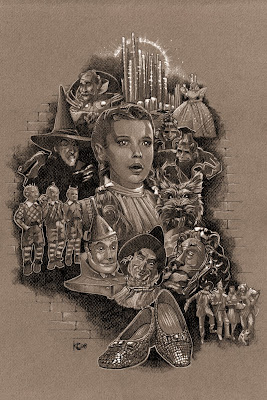
OZ - Value Drawing


Here's the value drawing for the painting, came out pretty well I think!

Saturday, November 15, 2008

Friday, November 14, 2008

Wednesday, November 12, 2008

Vampire! Look out! pt. 2


And here's the value pass for the drawing. I screwed it up with the marker colors...the lightest dark (if that makes sense at all) I had was a #5 - everything else was out of ink, so I used that.

Instead of doing the right thing and going to the store to get refills. Pfffft.

So I tried to push it back a little in photoshop, and leave the rest up to the pencils to pull out the detail.

Monday, November 10, 2008

Vampire! Look out! pt. 1


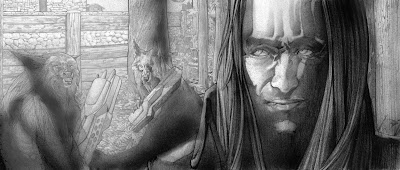
All right, here's the real beginning of this piece. (Oz stuff is still in development, still working on the value drawing...) The last keyframe for Templar...vampires and werewolves.

The complete pencils...

Friday, November 7, 2008

OZ - Sketches 13


All right, here's the composition, all the elements put together. Now I'm going to do a value study, to both test the composition, and practice the characters one more time before I start the final. I need some sort of background element to tie it all together, probably going to be some sort of brick pattern....obviously?

Thursday, November 6, 2008

OZ - Sketches 12


That last of the Oz sketches...just an accent of Emerald City, and that Toto I've been meaning to get to, for the group shot. It's two separate images, not Toto going Godzilla on E City.

Now I have to put them all together!

Wednesday, November 5, 2008

OZ - Sketches 11


The Lollipop Guild. Lobbyists for the Munchkin Campaign, trying to buy off the newcomer with sweets and creepy aggressive dancing.

Tuesday, November 4, 2008

OZ - Sketches 10


Oh, the ruby slippers. The B&W doesn't quite capture it, so I threw a quick color test over the drawing.

Don't forget to vote today!

Monday, November 3, 2008

OZ - Sketches 09


The Good Witch! I'm happy how this one turned out, especially since it's about the actual size for the final...pretty small, more of an accent to the piece.

Saturday, November 1, 2008

Ash Sketch


This is a work in progress site after all...here's the sketch for the Happy Halloween piece.

Thursday, October 30, 2008

OZ - Sketches 08


A finish on Toto, I found a picture to work from of the breed, instead of the actual dog actor, much easier!

Wednesday, October 29, 2008

Look out! Vampire! 01


Yes, I am still working on this, I've been dragging my heels a bit waiting on the writer, but I have to get this done to complete the set, and move on. I have a lot of stuff piled up ready to go after I get done on TF2 in a couple weeks.

Monday, October 27, 2008

OZ - Sketches 06


Fly, my Pretties!

Just a few more elements to compose and sketch, and I'll start piecing the final composition together...

Friday, October 24, 2008

OZ - Sketches 05


Skippin' down the yellow Brick Road. This is an accent that will be placed somewhere around the central composition, to fill in a hole. It will stay fairly rough, but I need to work on the detail on Dorothy and the Lion...and find something for Toto. The original shot has him following, but I might try him in the front.

Thursday, October 23, 2008

OZ - Sketches 04


Dorothy, second pass...much better, still not quite right, but good enough to use in the comp. I faded on Tot, I'll probably find just that type of dog to use for reference, instead of trying to hunt down a decent screen shot.

Wednesday, October 22, 2008

OZ - Sketches 03


Here's the take on the trio of misfits...I like the Tin Man, the Scarecrow still is not quite right, and I think the Cowardly Lion lacks some definition, the source I had for him was very low-res, still on the hunt to find a better pic, to better capture the textures of his make-up...