Monday, May 31, 2010

Going back to Oz - Troupe 02


Here's the painted version of the prep, yellow oranges for the Lion, red yellow/oranges for Scarecrow, and gray with blue for Tin Man, with some overspray from Scarecrow.  But with reviewing my reference, I think for the final, I'm going to put even more warm tones into Tin Man, to get that rust tone to show through better.


Final!  Lots of pencil work to pull out the features, I'm pretty happy with this one.  It's much smaller than the final versions, as the three guys together measure about 10 inches, in the final, they might be twice the size.

All right, this one has all the paint and pencil color mixes cataloged, and ready to go to the final piece.

Friday, May 28, 2010

Going back to Oz - Dorothy 01


And her little dog, too!  I had pretty good success with some of those Leia's, using the dark skin tone colored pencils to build over with the paints, so I did that again with nearly every element of the pic, using the dark black/gray to work in around the eyes and mouth, and for Toto.


With just a few fill areas, and some texturing, it was ready to go to paint.
Now, on to taking this pile of drawings and start painting!

Thursday, May 27, 2010

Going back to Oz - Off to See the Wizard 01


This one is a little worrisome, Dorothy's head is just over 1/2" high - I have doubts maintaining much of a likeness, but at this point, it's more important to get the colors right.


To that point, I'm going to approach it with a warm yellow/orange wash of spray for all, which is why I did the Tin Man with a dark purple to maintain his colors throughout, but we'll see...

Wednesday, May 26, 2010

Going back to Oz - Flying Monkeys 01

Is there nothing scarier? Along with clowns, sock monkeys, these old masks from the Oz movie, make the adult Me strikes out in primal fear if approached by any one. My wife laughs at me and says. 'but they're nice at the end!' But I've seen their capacity for evil.

Like clowns and sock monkeys.


I've had this image set for quite a long time, but now with a little more technical knowledge, I'm wondering how the heck I'm going to paint this one, with three distinct colors, blue, gray, and red? With danger being that I might turn it all purple with the combination of overspray.


I know I want these lil devils shrouded or casting shadows, so I think I'll do a strong pass onthe lower parts with the red, and keep it away from the blues, and let the gray be the in-between. So I put in a lot of lower blacks to help keep these sections separated.

Piled. Next!

Tuesday, May 25, 2010

Going back to Oz - Doorman 01

Since I missed yesterday, here's another piece for the Oz painting prep...


Well, come in, COMEEEIIIINNN! The doorman to Oz. I really want that green to be crazy saturated, so I did the bulk of the drawing with a dark green pencil. He's a minor character in the piece, so I used a broader pencil technique with him as well, bold strokes to indicate the shading, rather than blends and...


...washes with the a diluted black - though I may add a wash to the underside of the gloves and mustache, but I'll have to see how the paint turns out.

Added to the pile for Paint Day, and on to the next prep!

Going back to Oz - Troupe 01

It's finally time. Almost.

Doing final prep paintings to pick the colors and set the palette for the Wizard of Oz painting I've had composed for purt'near 18 months now...!

http://badflipblog.blogspot.com/2008/11/oz-value-drawing.html

One last set of practice pieces, done with no testing or experimental techniques, taking all that I've learned the last few months and putting it ALL in to these smaller pieces. For the most part, they all will be at a smaller scale than the final, but all the colors will remain the same, so here we go...


This is the transfer drawing of the troupe of misfits, I created a much lighter prime, and incorporated some colors into the lighter intended shades of the features. If you checked out the older value composition, you can see I changed the Cowardly Lion, I found an image I liked much better...


And here is the prep for the paint pass; I deepened the darks, painted in the blacks, with another texture pass on top.

I'm saving the back half of Scarecrow's hat for near the end, that will be painted in with black, while I hope to have color and a rim highlight to separate it in the end.

Time to put this one aside, while I set up all the other drawings for Paint Day!

Friday, May 21, 2010

S.T.A.R. Re-Design 03


Look out! Black Hole!

So that's the S.T.A.R. final, a leaner, meaner, robot gunslinger. I think this is a good start to a redesign, I think a pass with fresh eyes would take it to another level; off the bat I see issues with the lower legs, the bicep area, and the idea of holsters is cool, but another pass at those would help out a lot.

Also, I have hopes that the re-make really pushes the Haunted Ship aspect, so that's why I gave S.T.A.R. a bit more of a beat up paint job.

So, Joseph Kosinski, I know you must read my blog everyday- I just wanted to let you know I want to work on your The Black Hole Remake.

Thursday, May 20, 2010

S.T.A.R. Re-Design 02


OK, so here's the gray scale block-in. I have everything clearly defined, shapes, relative light source, etc. This is where I start judging the design, and seeing where fixes could be made, before making a final detail pass.

While I had a very specific vision for the head, it was not coming across in the straight on view, I couldn't manage to get the shading to insinuate a sloped back look, nor the depth - I tried to keep the general shapes of the original mask, but the goal was to re-orientate them into an updated look.

So I scrapped that head, and built another one up, based on a view from an earlier design sketch...


Much better, much more aggressive. With that solved, I went ahead with more adjustments, notably around the waist and thighs - I eliminated that rounded element that sat on his lower torso, and created a more angular solution, that fit the design flow better. And I wanted to get across the gunslinger vibe from the movie, so I fashioned these quasi-holsters for the twin barrel blasters, built into the legs. Another carry-over from the film - these guys were obviously guys in suits, walking around like robots, the costumes just had leather gloves to cover their hands, so I wanted to emulate that, by giving that drastic cut in the shapes across the forearms.

On to the 'paint shop!'...

Wednesday, May 19, 2010

S.T.A.R. Re-Design 01

I want to work on The Black Hole remake!

It's been stated that the next property Tron Legacy director, Joseph Kosinski wants to take on is The Black Hole. And I'm all for that. A terribly weird Star Wars ripoff from 1979, that for some strange reason has remained in the hearts of tons of people (well, boys) ever since release. But I'm not here to debate the merits and legacy of the film, I'm here to update a character!


And his name is STAR. Now, the movie scenes I managed to capture that showed the full suits, are of the Sentries, but STAR was introduced as a Super Sentry, pretty much exactly the same as the others, but painted black, with a ring of red LED's on his chest plate.


As always, I start out with some thumbnails - I had a page going, but doing some work on another painting, I had some leftover black acrylic, so I blotted out another design, the second from the right, and that's the one that stuck with me.

I really liked that head from the second sketch on the left, kind of the sloped back Black Manta kind of helmet/mask, so I added that to the body I liked, and took it to a pencil drawing.


Now with the pencils pretty much set, it's ready to go into photoshop for block-in's, and I'll make adjustments as I go...

Tuesday, May 18, 2010

Tales of the Bounty Hunters 01

Along with those Avengers sketches...I started drawing good ol' Boba Fett. I've been reading the Tales of the Bounty Hunters book (how in my excessive Star Wars Nerdism have I not read this book in the 15 years or so it's been out?!) so I found some inspiration in that. When I got the book, the first thing I did was roll my eyes at the godawful photoshop slam that was the cover.

So I started with Fett, and then decided to draw Bossk, and then the whole Idea sparked that I should do a mock cover to that book. But good. For over ten years I've been wanting to do a Bounty Hunter image, I just never got around to it, found the right composition, etc.


After Fett and Bossk, I drew in IG-88, and then the idea for the composition started coming together. Can't see it?


There it is! It was there the whole time, but mostly done in my head. So anyways, I sketched out the others, Zuckuss, 4-LOM, and Dengar, then composed them based on the rough idea.


So, that's pretty good. I think I might turn Bossk towards the viewer a bit more, and do Fett with a more forced perspective to fill in that lower right.

I named this post an 01, because I'm for sure coming back to this, but I have a pile of other stuff that needs to be done first...

Monday, May 17, 2010

Avengers Doodles.

Yeah, Iron Man 2 was awesome. So I sat down to watch 4 hours of Top Gear yesterday, with some blank sheets of paper. Didn't know what was going to come out...turns out, Thor. So I decided to do the rest....


Nothing especially awesome, I had no agenda, no art style I was working on, and no particular version of each character. I kind of just did them to get warmed up, and see if any ideas got sparked...and something did get sparked, just not comic book related. But that's for tomorrow.


But before I put this to bed, I wondered if these separate sketches could get comped together, so I ran them through photoshop, and threw some color on them. I guess I didn't feel like drawing feet yesterday!

So, that's that.

Friday, May 14, 2010

Ironhide Sketches...


That Ironhide series came out this week - I would have loved to have done covers for it...but I am not. I did a page of thumbnails back when it was announced, just out of annoyance of his death in the ongoing series. But, I may do something with that top image sooner than later...

Wednesday, May 12, 2010

Silver Surfer 02


How Cosmic. It's kind of weird to see my new coloring techniques applied to an old drawing, it's a little hit or miss, but overall it came out OK.

His body is maybe a little more rounder on the edges than I would have liked - I really like the slat look to his torso and abs, I wish I had put a little more of that into his chest and arms, even his face. First time I ever drew the Surfer in a realistic pose/version, maybe I'll come back to it in a new image, and try to work out some of my design kinks?

On to the details. I have a little trick I do, when it comes to 'chroming' stuff - it doesn't always work, since I depend on a filter, but more often than not, it turns out OK. I wasn't quite happy with the look to the Surfer, and while I enjoy a more matte look to him, I still wanted him to have some chrome shine. So I copied the board and Surfer into a new layer, and hit it with the Photocopy filter at 1-50 contrast, with black and white in my palette. Then I turned that layer into a Multiply, to get some extra blacks, in a more organic way. Sometimes it looks like chrome, sometimes it doesn't. Then I take that layer, and use blurs, erasers, and opacity levels to get it to blend in with the under layer.

The back ground is a punched up starfield, that I warped a bit, and the cosmic is a Brusheezy brush from Hawksmont, (whom I highly recommend!) that I used a partial of, and then warped it and stamped it around.

Then a layer of diffuse highlighting, and I call it done!

Tuesday, May 11, 2010

Silver Surfer 01

Well, this is going to be a short series...I forgot to save the pencils separately before I started the final. And now I can't find the drawing...maybe I don't even own it anymore...it was drawn quite awhile ago, set aside and forgotten. I filled the pencils with gray, and left it alone for over a year...


Anyways...I did some smudge tool magic, and smoothed out the pencils, did some fills, and punched up the tones to get the pre-chrome look - he's looking a little 'matte' right now.

Now it's on to the final, adding more shine and flare, some outer space to the background, and call it done...

Monday, May 10, 2010

Han Revisited.

So I felt I was on to something with that digital pass at the Princess Leia. Obviously for work, it's pretty much all digital, and I'm no stranger to coloring pencil art, but this time I thought I would try a different process, combining what I've learned with all these paint tests, and how I work in photoshop.


As we all know, I wasn' t too happy with how the Han and Leia Portrait came out, so I thought I'd revisit Han one more time. And since I viewed this as a coloring test, I just used my trusty black Col-Erase pencil. But. If this was for work, or even portfolio, I'd recommend using a couple of different pencils with light and dark lead weights instead.


So I scanned in the drawing, filled in the blacks, and used the smudge, blur, and erase tools to smooth out the pencils. I probably could have spent a bit more time on it to get a little bit better likeness, and smooth out the 'digital mush', but I wanted to get to the coloring!


Here is the first pass, using techniques of color layers that I normally use for things like Transformers, but against the varying levels of gray, this coloring made most of the skin look 'blown out.' So I copied that color into a new Multiply layer, and blended it...


...making it a lot more subtle, and natural. This is a technique definitely worth developing...!

Seattle Times...Front Page.


Bet you're feeling bad you haven't become a Fan of Electron Boy yet. Don't worry, you can still be cool...

http://www.facebook.com/home.php?#!/group.php?gid=113174135389294

Become a fan, build the numbers up and get awareness out there for this kid, and help out with the Make A Wish foundation. Here's the follow-up to this incredible story, which ran yesterday...

http://seattletimes.nwsource.com/html/localnews/2011818266_electronboy09m.html

I knew they were running the image yesterday, but I didn't know (and neither did writer, Katherine Long) that it was going to be on the front page! Awesome.

Go Electron Boy!


All right, we'll now return to our regularly schedule art disasters...

Thursday, May 6, 2010

Still not a fan of Electron Boy?

Well, get on it, folks!

http://www.facebook.com/home.php?#!/group.php?gid=113174135389294


Well, one more for Electron Boy, hangin' with his bud, Spider-Man!

Of course, the making of to follow...


The line art...

...and the doodle that started it.

Wednesday, May 5, 2010

Are you a fan of Electron Boy?

Not yet? Well, you should be...join his Facebook Fan Page!

http://www.facebook.com/home.php?#!/group.php?gid=113174135389294

Here's an awesome story, a Make-A-Wish dream come true. A kid, Erik Martin, aka Electron Boy, wants to be a real superhero for the day...and boy, does Seattle make it happen! Please take the time to read about this incredible story:

http://seattletimes.nwsource.com/html/localnews/2011740342_electronboy30m.html

A mutual friend of mine, and of the family, contacted me to create a mock comic book cover for him, to keep the dream going, and here's what I came up with-


Swell of trumpets and drums....ELECTRON BOY! I love this story, and was honored to be asked to contribute, and so proud of my former home for going all out to make this little guy's dream come true.

And since this is a 'making of'' site, here we go with some works in progress;


When I got asked to do this, there wasn't a lot of great full shot pictures, and the pictures taken from over the course of the day, had him in different iterations of the costume, hence the helmet, and now backpack. Later, as more shots were posted to the net, I finally saw a pic of him in his official uniform, so I made the changes, took off the hat, and added the straps.


This is were it all started...the quick sketch to find the pose, make some room for the Space Needle, and try to keep some room for the logo. And that's that.

Go get 'im, Electron Boy!

Tuesday, May 4, 2010

Princess Leia Portrait......F+


I think this one was doomed from the beginning. This is the second attempt at a sketch, the first one I just quit on, and while this one turned out okay, the likeness just isn't very strong.


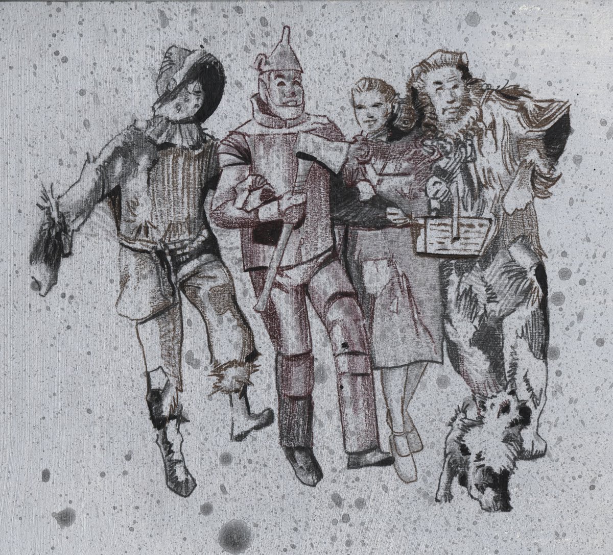
Now...keep in mind that all four of these images were painted on the same piece of paper. Third try at drawing this image, and again it turned out different than the first two...again! Somehow I lost the jawline, and just kept going...?


So I set it up for color, but it still it wasn't looking right. I thought maybe I could spray some thin black paint to help with the shadows before I hit it with some color...


...and that was the WRONG thing to do. Making a black fill, letting it dry, then painting a color on top (for example, her hair) layers the color on top of the black - spraying black and then a color BLENDS the two - not the reaction I wanted. You're supposed to build colors to get the darkness, not just shoot some black in there.

Photoshop painting tricks don't ALL translate, by the way.


It was so muddy dark, by the time I got to the pencils, there wasn't much I could do. Trying to bring out the highlights took so much rendering that it got so waxy and muddy on the surface, I had to stop. I suppose I could have went back and re-sprayed the flesh tones and try to work the pencils again, like I did with the He-Man with limited success, but I had 3 other portraits that came out pretty well, doing it the RIGHT way. Princess Leia grade - F.


So I just fooled around with it a little more, and it got no better. She looks like a zombie.

Final grade, F+; which to me is worse, like getting an F punctuated with a shot to the arm. F...PLUS! PUNCH!


Annoyed at my failure with this one, I brought the sketch into photoshop, and colored it in literally 4 minutes. Then I saved it off to fool around with it later, and accidentally saved it as a jpeg, so that's it.

F for backup procedures too, I guess.

Monday, May 3, 2010

Slave Leia Portrait 02


I tried to do something a little different with the paint this time, an orange-y base, and then I added some red to the paint, and went over it again - it was really subtle, but I think it gave it a little more depth, and saved me a bit of extra rendering with the colored pencils. In any case, again the pencil work underneath blended really well with the airbrush colors.


The skin tones came out pretty fast, the paint really worked well, and it was mostly a matter of pulling out the highlights with the lighter colors, and not really using an skin tone matching pencils. I used a dark brown and a black for the dark parts, eyes, jawline, choker, hair...


And again with the finishing touches, white and black airbrushing, and some touches of white for the highlights. I haven't bitched about the scanning in a while, but this one in particular looks pretty good in real life.

Still, an A-, the dark gray prime holds it back, and while it's a decent job on the hair, it's a little lacking in 'life'.

Tomorrow - the final Princess Leia portrait post, something I like to call "AN EPIC FAILURE!" Stay tuned...