Friday, April 30, 2010

Slave Leia Portrait 01


3rd in this test series is Slave Leia...of course, I would be remiss to not include this incarnation, right? This is the sketch warm-up, the hair is kind of rushed, and I lost a bit of the likeness...


...so I spent a little more time on the transfer drawing, capturing her eyes better, and the thinness/angles of her upper lip, the two most lacking likeness elements from the sketch.


With some spatter and fill with the black paint, she was ready for the airbrush...

Thursday, April 29, 2010

Endor Leia Portrait 02


Damn me and this too dark canvas prime! Again the pencils and paint mixed well, but the darkness of the prime just kills the saturation. And I'll bitch about it again in the other Leia's coming up, I'm sure...


So despite the darkness/desaturation, I managed to pull some life out of it with the pencils, and I like how the cast shadow mixes with the roll shadow around her eyes, and around the chin strap. That was the main thrust to do this particular image, so I think it was lesson well learned.


With just a bit a dark brown airbrush to smooth out the darks a bit, and a couple spots with white...done! I'll give it a B, with marks off for the dark primer, and I missed an opportunity to add some texture to the leather with that water reduction technique - that wasn't the point of the exercise, but I should have done it to practice...in the very least, it would have made it more dynamic, I think.

Wednesday, April 28, 2010

Endor Leia Portrait 01


This one is a bit of a cheat, in that I feel I have a pretty good handle on hard surfaces, so I chose this image of Leia with the helmet - I'm still kind of sucky at hair, all my drawing and digital tricks aren't translating very well! - but I did want to try some cast shadows. So again, I started with the 1:1 sketch with the col-erase layout pencil.


And again, I used a few colored pencils to build of the forms that I didn't want too heavy with black...


...and after I put in the darks with black paint and spatter, I went back with a dark brown prismacolor to darken the leather straps of the helmet.

Prepped, and ready for paint!

Tuesday, April 27, 2010

Hoth Leia Portrait 02


With the drawing set, I went ahead and broke out the colors. I was really happy with how the under drawing with the colored pencils blended with the paint, but I could tell already that the prime gray was about 15-20% too dark...


...so when it came time to start the pencil work, I thought that it may be a problem with muddying up the highlights, just trying to get the contrast up to a certain level. And it did happen in certain areas, notably in the right forehead and cheek area.


Here's the final, with some airbrushing of white and black to push the contrast a bit more, and some touches of white in the eyes and hair.

Overall I give it a B, the too-dark prime was obviously a big problem for the color rendering, and the hair looks less than it did in the b/w pencil drawing. At 5x7", it's just OK as a stand alone, but probably in a group portrait, it might come across better? And I managed to maintain a pretty good likeness of Fisher/Organa from beginning to end.

But I confirmed some suspicions about the pencil rendering before paint, so lesson learned, and it's something I'll continue to do as I move forward.

Monday, April 26, 2010

Hoth Leia Portrait 01

All right, one more round of paint tests before I get really serious. I still need to work on portraits, and with the less than overwhelming Han and Leia piece, I go back to Star Wars for inspiration.


And again I wanted to just do a drawing to get familiar with the details before starting the final, this is just a black Col-Erase layout pencil on some drawing paper.


I went back to a gray primer, (instead of the warmer primer I did for the H&L test) but I think it got a little too dark. As I'm quartering of the page for four tests, they might suffer a little due to the darkness, but maybe I can turn that into an advantage? Anyway, the size of these is around 5 inches high.

Instead of just using the dark HB pencil, I'm using some prismacolor pencils to define the form of the face and hair - browns, oranges, yellows and reds, and other areas I want a bit more softer, like her white Hoth outfit: I'm using browns and warm grays for that.


Just a touch of black paint for the really dark parts, and a bit of texturing, it's finally ready for some airbrush paint...

Friday, April 23, 2010

Middle America Tour 2010


And here's the last one for 2010...so far. Robb and Elissa from TPR like this old one so much, they asked me to re-purpose it for this year's tour through the same general areas of the U.S.


St. Louis was going to be a stop along the way, so Robb suggested I replace the track with an approximation of the St. Louis Arch, and I made a few other adjustments to differentiate it from the original design, primarily flipping the line art and recoloring it.


And of course, the shirt front tag.

Well, that's it for this year, have fun on those tours, everybody!

To find out more about these worldwide theme park tours, go to: www.themeparkreview.com

Thursday, April 22, 2010

Theme Park Review - IntimidaTour 2010 Final


Vroooom! And here is the final for the IntimidaTour shirt design. I used an appropriation of the ride logo, and copied and stretched the 'I' to make the capital 'T', and used the font for the 'Earnhardt 3' for the numbers and the chevroned TPR, then usual for the locations.*


And of course, the all important tag for the shirt front.

To find out more about these worldwide theme park tours, go to: www.themeparkreview.com

*At the time this design was turned in, Kings Island and Camden Park were NOT confirmed. There's an alternate design that deletes those two tour stops, just in case.

Wednesday, April 21, 2010

Theme Park Review - IntimidaTour 2010 02


Fairly easy transition, this one. Very nearly straight drawing to line, and on to color...


...trying to stay true to the actual Intimidator Ride, but with a custom TPR car!

To find out more about these worldwide theme park tours, go to: www.themeparkreview.com

Tuesday, April 20, 2010

Theme Park Review - IntimidaTour 2010 01


Now this one was the most thought out idea that Robb gave me when we first talked about this years' shirts back in December. "We want a Nascar one." Awesome. I gave it a crazy Hot Wheels track in my mind, and then it practically drew itself!


I changed the orientation a bit to show both the side and front, so I could display the '3' over the door, and display the TPR Racing logo for the hood.

On to the digital cleanup...

To find out more about these worldwide theme park tours, go to: www.themeparkreview.com

Monday, April 19, 2010

Theme Park Review - Europe Tour 2010 Final


And here's the jaunty final. I liked this one, a good mix of an homage to those old Disney posters, but still clearly a part of the Theme Park Review style established over the years.


Again, the tag for the shirt front.

To find out more about these worldwide theme park tours, go to: www.themeparkreview.com

Friday, April 16, 2010

Theme Park Review - Europe Tour 2010 02


And now the linework for a thrilling and terrifying ride through the countryside! Not really. It looks pretty fun and easygoing...

A lot of sections make up this piece, I tried to keep the 'multi-plane' elements separate until color - Track, Train, Foreground Nature, Background Nature, Back Tracks, and rather than spending time on the people in black, and then trying to bring color into it, I saved time by holding off on them until rest was completed...


...and then I outlined the drawings with the selection tool, filled, and placed. The next step is to do the graphics and color corrections for final!

To find out more about these worldwide theme park tours, go to: www.themeparkreview.com

Thursday, April 15, 2010

Theme Park Review - Europe Tour 2010 01


After a quick brainstorm of thumbnails and thoughts, I hit the wall on what the theme for this shirt would be. Usually the recipe for the TPR T-shirt designs consists of taking a location icon and toon-ifying it, but that didn't really seem to be the case with this tour, no Rome = no Coliseum, no Berlin = no Brandenburg Gate, etc. The Nurburing was tempting, but so complex it wouldn't make sense in the context and themes of these designs. So I stuck with the Eurorail idea, just decided to highlight the beautiful countryside of the area...


...but made a bit of a departure from the previous designs. Instead of toon-ifying, I went a little more Disney-ifyed, using these classic posters as inspiration. The plan wasn't to go whole-hog, and just do a Disney version of the design - I wanted it to be able to stand with all of the other TPR designs in the end...


So again, I made a rough drawing to get started on the final. Usually the drawings are followed fairly closely, in that I just digitally trace and clean up the pencil work, then make adjustments, but this time, it was more of a plan of attack, because I was going to be using block colors (not just outlines, with an easily adjustable color fill) too; elements would need to get locked down earlier in the process, therefore being harder to adjust in the end...

To find out more about these worldwide theme park tours, go to: www.themeparkreview.com

Wednesday, April 14, 2010

Theme Park Review - UK Tour 2010 Final


Final! After putting in the shading I started in with the graphics - I had a really hard time finding the right font, and placing it for the UK. So much so that I put it aside and went on to another one before coming back to finish. Graphics are usually pretty easy to do, and come together fast, but I had a block or something with this one.

So I finally got it figured out, and placed the logo and locations, and used the colors of the British Flag, for Queen and Country.


And also I created a tag for the T-shirt front.

Tomorrow's post: Europe Tour 2010!

To find out more about these worldwide theme park tours, go to: www.themeparkreview.com

Tuesday, April 13, 2010

Theme Park Review - UK Tour 2010 02


And here is the linework for this design - I switched the Eye and the Gherkin from the rough drawing, it worked better compositionally, and after adding a bunch more Palace Guards to the Red Bus, it was ready to go to color...


After filling in the all the different colors, it takes a bit of time to color correct, and make sure all the colors unite the design. Then I took the black line art, and changed the colors around to accentuate the object colors. Now it's onto the final touches, shading and graphics...

To find out more about these worldwide theme park tours, go to: www.themeparkreview.com

Monday, April 12, 2010

Theme Park Review - UK Tour 2010 01

It's that time of year again! I've been invited back for a fourth year of designing Theme Park Review's tour logos! First up - UK Tour, 2010!


I've known about this tour since December or so...so I've had time to think about. Not too much time spent on thumbnails, I had in my notes that they wanted a Palace Guard, Big Ben, and some other London/UK icons in the design. Being a former Red Bus Tourist myself, I decided to make that the 'ride' for this tour, to tie it all together.

After getting the thumbnail drawing approved, I went ahead and did this rough drawing, to take to the next step...tomorrow's post, line and color!

To find out more about these worldwide theme park tours, go to: www.themeparkreview.com

Friday, April 9, 2010

Sky Doll Revisited Final!


So after a few more minor color adjustments, I did a new highlight layer, to bring out the form even more. I did some more background punch-up, adding some hearts - because she's Love Machine - and put a thick outline around the elements to give it even a bit more kick.

I'm pretty happy with this one, I finally got my vision out of my head, if not with paint, then digital magic!

Thursday, April 8, 2010

Sky Doll Revisited 03


Some more progress on Sky Doll, I was interrupted by actual work, so I'm not quite done yet, but this is a good place to pause.

Over the last few years of me working in this style, this is usually where I stop - Line Art, Color, Soft Shading, Hard Shading, and maybe some glints of highlighting and F/X here and there. This time, I'm going to really put more into the highlight/F/X stage, and do some more 'illustrative' accents to push this style to another level for me.

Wednesday, April 7, 2010

Sky Doll Revisited 02


After making a few adjustments to the line art, I put in the flat colors. Now this isn't probably going to be final colors, it's just easier to make adjustments with a fill, rather than guess in the blank areas as to what color would work best. I also threw in a background image; it makes it easier to balance and adjust colors against something, instead of the stark white background.

Tuesday, April 6, 2010

Sky Doll Revisited 01


So I'm going back to Sky Doll, but I need to practice up on my animated style for an upcoming project. Anyways, this is the line art from the original drawing all cleaned up, but I'm going to push it into the more exaggerated style in the face, and maybe some other elements to punch it up a bit...

Monday, April 5, 2010

Galactic Heroes X-Wing Final


Done! I masked off the stripes, and did a quick overlay of red and yellow, to even out and saturate the colored pencil, deepened the blacks, and created a glass reflection for the canopy. Then a quick pass of pure white for all the highlights...and done.

Overall pretty good. I wish that I took the time to take a more clear original photo, all four cannon heads seem to be different shapes and sizes, but the overall impression is relatively untouched.

On a technical level, I'm finding it's been working out really well to back and forth the media, underpaint, then pencils, for the bulk of the work. Then with minimal time to do some overlays with paint, and detail punch-up with the pencils, it seems to really make it come together in the end.

Saturday, April 3, 2010

Han and Leia Final

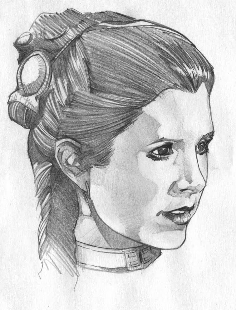
Looking back, I should've let it be. I did a quick spray of orange to try to tighten the pencil work, and it ended up muting it a bit too much. Doing a quick pass with the pencils to bring it back out ended up just muddying up even more, and also losing the likenesses a bit as well, so I just stopped.

It doesn't get the 'FAIL' however; since this is intended to be a learning process for me, I did get a lot of ideas to approach this differently. The rendering technique is good enough for a certain level, comic interiors, smaller portraits (Leia's face is about 3 1/2" high, Han's 4") and mistakes nonwithstanding, I think the next batch of these smaller images will be even better.

Overall, the drawing was strong, and I was really happy with the underpainting on this one, the rendering has been a bit of a problem for me; it gets muddy, as I'm still a little too heavy handed, I need to keep working on people and drapery - the more organic stuff. Since I've been working digitally on robots and vehicles for the last two years straight, (almost exclusively!) I'm losing my touch - I need to keep up on the softer side of life!

The plan will be for quite a bit more drawing the facial forms with the color pencils along with the heavy black pencil. When I did the underpainting, it help so much in defining the curves of the face - trying to emphasize that with the pencils on top got so muddy, it lost most of the subtlety. Next time I'll try to keep the post-paint pencil work to just the structure of the face, eyes, nose, mouth, and jawline, and see how that turns out.

Friday, April 2, 2010

Galactic Heroes X-Wing 04.2


Here's the final pencils for the GHX-Wing. The red and yellow colors on the fuselage are little less saturated than I would have liked, so I might mask that off and do a quick airbrush pass to brighten them, and then go back over with the pencils.

I still need bring the contrast up, add glare on the canopy, and do the highlighting around the ship and the stars.