It was inevitable that I would hit a speed bump in developing these new (to me) painting techniques. Well, ladies and gentlemen, here it is. Let me just start with the roughed out image, because in all honestly, this is exactly where it went wrong.
I had a quasi-idea of what I wanted for the composition. but a very specific idea of the monster. I had this sketch laying around for months, and I'd been wanting to do something with it. Instead of drawing a frame from scratch, using the lion and a new drawing of the monster, I just incorporated the sketch into the image, figuring I'd build around that.
Wrong.
I wanted to show cliffs, some city elements, and make it a beachfront temple scene like the Kraken finale of the original Clash of the Titans, so I scribbled it all out - around the old drawing of the monster. And what I did was force EVERYTHING to conform to the monster, at the expense of a strong composition, with a definitive focal point.
And what I got was this. A pretty cool monster, surrounded by mush. What is that ring around him? It's supposed to be a pit with a ring of columns around it, with stairs leading up to it. But the Lion is higher up than that, on a...what? Earthquaked ground coming up? OK. Just that alone should have made me re-compose, to either pull out the shot to show that happening in other areas, the relationship to the ground and the temple architecture, and stregthen the relationship between the foes. Just because they are facing each other in action poses, doesn't mean that the environment can't play a role.
And there's a city in the background, that looks like a pile of square poops. Oh, and there's ocean and a beach in there too. That's the problem with trying to fit in a bunch of exercise elements - I failed the piece in the interest of the background elements. And then over AND under-colored to try to get everything to fit together, when the problems were in the fundamentals of the composition.
Had I only dropped the 'camera' down to ground level, or lifted it to a birds' eye view, I think it would have created a stronger composition with the exact same staging. OR, I could have just decided to do what I wanted, in any sized framing...and here's what I came up with in literally three minutes:
The 'scribble in three minutes' is better than the day and a half painting above. It's a clearer composition, the lion and monster are connected by the stairs, you can see the columns better, it's a more interesting geographical locations, and it's immensely more dynamic. Also, if I wanted to add in the city, etc. there's room on the sides, low angled, and wouldn't compete visually with the point of the image- lion vs. monster.
And here is the overall idea, composed as I had originally envisioned it. But guess what? No way that's going in the portfolio, when I get time, I'm going to paint out the above sketch - it's way better.
But first, I still need to work on environments, so there's already a new one ready to go later this week. I needed to achieve something much more naturalistic, than this color abomination.
We're chalking this one up to a learning experience, folks.
Tuesday, January 31, 2012
Thursday, January 26, 2012
Roman Lion Step by Step
This is the exact same process I used for the Predator image, so maybe refer to that for more in depth techniques, but I'm sure there will be some cross over. I had the pose in mind before even starting, but it took a couple of sketches to land on the right angle. Again, I'm still not really blocking out in color, depending more on some sketching (which I accidentally deleted!) to get to the more or less tighter drawing. It's pretty straight forward, I combined a couple of Roman armor looks, from found replica costume pics on the internets - I wanted to achieve a mix of leathers and metals. But I wanted a more gladiator type helmet, and I thought a lion with rams horns is probably going to look pretty cool.
I blocked out the background colors, and then chose material colors for the primary and secondary flat colors, on an layer underneath the drawing, preserving some of the shading to use when I merge color to drawing.
Here I bumped the saturation up, and did an overlay pass with a light golden color, to bring out the lighter points, to use as color picks for the rendering.
So here is the beginning of the rendering - I had merged the color and lines - I start with the face of the lion, as that is going to be the intended focal point of the image, so that gets the most clean up and attention.
So begins the multiple passes of detail, starting out with a bigger brush and broader color strokes, focusing in tighter and tighter as I go.
By the way...that outreached hand was bugging me to death. So I buffed it out, took a photo of my hand, inserted it and did a paint over to match the rest of the lion. I had sketched it more than a few time before starting the color render. But I was feeling pressure to get going on the image, so I called it good enough - I painted that hand at least three times, and it just wasn't dynamic enough. So that's a lesson : If something doesn't work in the drawing, it's still not going to work in the painting.
Those crazy fundamentals.
So this is the pre-final pass. I'm pretty happy with the figure overall. So here I take a break, and then come back with fresh eyes to put the finishing touches and atmosphere blends.
Final! A bit more detailing, color adjustment, and a little bit of foreground haze to tie every thing together. He's in a fighting pose, so I wanted to insinuate something off screen that he's facing down, with the drift of embers...
Tuesday, January 24, 2012
Roman Lion
Rawr.
So this is the followup to the fishman image - I took all I learned from that (and the Predator) and threw it into this one. I wanted to do an image with a lot of technical things to achieve; fabrics, leather, metal, hair, along with a more dynamic angle.
Why am I humanizing animals, like the fish and lion? It's fun for me! I like talking animals, what can I say? A huge childhood influence on me was Disney's Robin Hood - give a fox a bow and arrow, and I'm sold. And another thing I like to do is take cartoon-y things and try to give them a realistic iteration. Kind of why I'm loving working on Transformers stuff...
Also, like the Predator, I saved out a step by step as I went along, that I'll post at the end of the week...
Friday, January 20, 2012
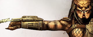
Predator Step by Step
So this is more or less an new technique for me, building out shapes with color, and then going in to detail. It's a very common technique, but I'm much more of a drawing artist than a painting artist, in that I draw everything out first, then paint it, and add extra details as I go. For this experiment, I chose a subject that isn't a straight concept, (that's next!) but something established, to help keep me honest as I focus on the techniques. I really enjoyed the looseness of the Fishman image, so I wanted to approach something like that again, and not rely on selections and paths to help out.
1) So of course I start out drawing the Predator, on its own layer. After all, I am an old dog. But I just really roughed it out - since it's an existing character, the shape is defined already, so I made sure to get the correct details, before I abandoning the drawing for the color block-ins.
2) On a layer underneath the drawing, I start with the color fill. I just blocked in the main colors, only a few for the core colors, and a few more to define the highlights - the black drawing defines the shading.
3) Now I begin to block in the tertiary colors, using the pick tool to help blend the colors, using a smaller version of the brush, with around a 20%-40% opacity.
4) I merge the two layers to a single layer (leaving the background layer white) and I begin to add in and accentuate the details, going around the image, sharing color picks to maintain cohesiveness. As I add in the detail into the focal points (in this case, I'm concentrating on the head, secondarily the rest of the body, and even less along the arm and fist) I'm still using the same opacity range, but the brush is getting smaller and smaller. Also, I switch to a hard edge point brush for finer detailing on the gauntlet details, and other spots here and there; chest armor, hair bands, neck piece, etc.
5) Here I do a quick color adjustment, a little brightness/contrast, and a soft edge airbrush to help blend color edges, at around 10% opacity. I then go back in with the detailing, decreasing the size of the brush, and increasing the brush opacity, to get tighter and tighter details. I also use the smudge tool a bit, to help redefine edges around the hair and metal pieces. Use the smudge tool sparingly - it's really easy to turn your image to mush - it's always better to use the brush, and pick colors to define and blend elements.
6) Here's the last relatively rough detail pass, getting tighter and tighter with the elements and indications.
7) Now on to the final detail pass, making sure I'm happy how the Predator is reading, and adding final details like the netting, and hot point highlights.
8) Final. After yet another fine detail pass, I make an adjustment on the values, and tweak the colors just a bit. I add a quick background, mostly color faded on top of a texture photo I had taken of a concrete wall. I wanted it to be really subtle, and make this mostly a graphic image featuring the Classic Predator. After I finalized the background, I move back to the Predator layer, and use the blur tool to soften the edges of the arm. Then I do just a couple of quick soft highlights - 10% opacity, white color, soft edge airbrush, to help tie together the figure and background just a little bit more.
Tuesday, January 17, 2012
Predator! Look Out!!!
There's that ugly MF'er.
Here's a brief interstitial piece in between the Fishman, and the next image inspired by those techniques. I had a lot of fun on the Fishman, but I wanted to explore a more dynamic armor, and actually paint something digitally from scratch, and leave my usual methods, developed by working on Transformer designs, in my toolbox, and develop some new approaches.
Looming over my monitor in my office, is the Hot Toys Predator, so I didn't look too far for a subject to use as a model. The goal was to paint looser, building up from blocked in colors, rather than build up in grayscale, and color in a separate layer. I also didn't let myself use selections or paths for clean lines and edges, though I may have hit the shift key here and there for ultra straight lines on the gauntlet. I'm pretty happy with the results, I met the goals I set out to achieve, and it set me up for the next 'real' image. But until then...
I actually saved off progress images as I went along, and in a few days I'll post a tutorial on how I created this image. Something far more instructional than the work in progress images I usually post.
Thursday, January 12, 2012
Land Shark - Certified Pre-Own
After college, and I was finally wholly supporting myself, I bought myself a new(er used) car. What I traded in looked a lot like this, except it was colored tan. Beautiful Ford Tan. A 1988 Ford Tempo, missing a headlight, and featuring a dent on every single panel of the body. Including the roof. From the inside. Wobbly steering column, bent seats, and an...'aroma.'
So that's the inspiration behind this version of the Land Shark, with coloring being influenced by my Dad's old '70 Camaro, Bottle Green with Black Stripes. Which my mom made him trade in for a VW van. Orange. Because of too many speeding tickets, and the impending me.
On to the work - this is the same body as the version featured in the 'Lost' frame, just beat all to hell. I removed some panels, showing more mechanical parts, added in a bunch of dents and textures, and some extra cabling, just to keep the hunk of junk going!
All right, that's it for the Land Shark series! I had a lot of fun with these...
Wednesday, January 11, 2012
Land Shark - Racing
Since the speeder was so clearing influenced by F1 race cars, I decided to do one full tilt, and deck it out with a racer paint job, in Ferrari Red.
For the body mods, I extended the upper intake, and gave it a bit of a rudder function, trimmed the spoiler wings, added a windscreen, took out that engine bump that used to sit in the area where the 56 is, and curved all the forward intakes into barrel mouths, rather than the squared off corners of the others.
Next, and last...the Land Shark Pre-Owned Program.
Tuesday, January 10, 2012
Land Shark - Military
For all your invasion needs. Here I added more of an armored flow to the body, built around a minigun installation. Tweaked the upper intake, and the spoiler. Also put a canopy and more armor over the cockpit area. Slapped on some desert camo and graphics, and called it good.
Next, wanna race?
Monday, January 9, 2012
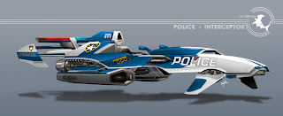
Land Shark - Police Interceptor
So here's a Shark Week of sorts, a few additional models based on that speeder from the 'Lost' frame a few weeks back, which I've been taking to calling the Land Shark.
This one stays pretty close to the original - I added a light bar to the tail, and some spotlights into the fuselage. Then I created some simple badge decals, and gave it a blue and white paint scheme.
For the Land Shark logo, I painted an outline based on a photo of a Hammerhead shark I found online, and then composed around it a series of lines, based on the logo for the B-17 Flying Fortress.
Next, we go to war...
Friday, January 6, 2012
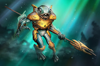
Fishman 02
BUBBLES!
Final. Lots of tweaking on this one, finding better ways to do things. So much so that I think I'm going to design some more intricate armor in the next few weeks, it was a lot of fun, and used different skills that I bring to the robot designs. Lots of multiple passes with overspraying colors, and multiple highlight layers to get that watery sheen. But I have some other things to get to first.
Next week, I'll be posting some revisits of the Land Shark speeder. I went back and did some alternate models of the speeder from the 'Lost' frame a few weeks back. So stay tuned...
Tuesday, January 3, 2012
Fishman 01
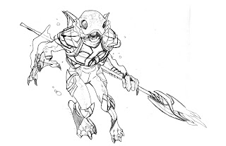
Remember this? It's Fishman from last year! Anyways, here's a quick sketchover before we get digital:
I decided he needed a bit more form and construction to his armor. He originally was conceived as having smooth skin, that was accentuated by the smooth armor, but it was looking like the piece was going to turn out a little flat, so I put in some sort of metal braiding, insets, etc, and tried to break up the form a little more.
Now here's the digital paint. Still needs another detail pass before it goes to color...
Monday, January 2, 2012
Star Wars Fighter Pods!
The site is up! Coming February 2012!!! Just weeks away!
Star Wars Fighter Pods!
Been working on and off on these little guys since last winter. I started off doing a ton of vehicles for Eric Siebenaler, ( a great love in my life!) who had come in to art direct and design the product, after years on the Transformers team, moved over to the Star Wars team at Hasbro. After I wrapped up doing a bunch of vehicles for him, I begged him to let me help out with the characters. He already had some folks going on that while I did the ships, but a month or so later, he found some guys for me to do after all. And now, I've worked on a ton, I don't even have the count any more. Either doing view turns based on his front views, or doing guys from scratch under his art direction, it's been many. I would say a plethora.
Unfortunately, due to the myriad of NDA's and licensing agreements, I can't post any of the art for it. I will say that when I did beg Eric to throw me some characters, it was not just an email, but a little cartoon based on his defined art style for the line. It was a sketch of Vader in a pose suggesting Eric would be force choked if he didn't let me draw some guys. And that is now a Fighter Pod figure, bottom left in the first batch of the page I linked to above! And so far from the released images, my favorite figure I worked on was the Han in Carbonite - can't wait to get my hands on that one!
So thanks to Eric for having me help out with this line, and congrats to the ton of people that it takes to make these little guys a reality, I'm really looking forward to going toy shopping in February!
Subscribe to:
Posts (Atom)


