Monday, February 27, 2012

The Next Epic - Sleeping Beauty


This is a departure of sorts, from the expected nature of this long term project - among the 15-20 titles I want to paint for the eventual show, there are a couple of animated features on the list.

Sleeping Beauty is my favorite Disney movie.  While not as artistically influential on me as Robin Hood or the Lion King, the style of Eyvind Earle captures my imagination every time I see his work.  As in 'I could never do that as an artist' type of feeling, along with Mary Blair, and a few other Disney visionaries.  But after saying that, I avoid his beautiful background work, and focus on the characters, because if anything competed with Darth Vader's role as the scariest villian to me as a kid, it was the lady in black that could turn into a dragon.  Holy smokes.

Since it was a movie full of dark scenes, I wanted to go for the darkest moment in the film, at the tipping point between good and light, where it seems all may be lost.  So expect lots of warm grays, greens, and black upon black, surrounding our good Fairies, watching over the sleeping Briar Rose...

Next, a color comp of Maleficent...

Tuesday, February 21, 2012

Eat Your Art Out V!


Want the chance to buy this, real cheap AND support a good cause?


Eat Your Art Out V:
Carnival After Dark
Presented by:

Angel City Derby Girls
and Titmouse Inc.


Eat Your Art Out is an annual fundraiser for the Angel City Derby Girls, LA's Flat track Roller Derby League.

Curated by Carmen "Jane Dope" Acosta.
After 4 fantastic years with Meltdown Comics, we will be collaborating with Titmouse Inc. in Hollywood, CA.!

This year's theme:

1900's traveling carnival. Inspired by the ethereal creepiness of this early American tradition, all artwork will depict this darkly styled atmosphere and reflect the curios and wonders one would expect to see during that era.

Entry to this event is FREE! Doors open at 7:00pm and there will be an OPEN BAR for you freaks that are 21 years of age and over. Guest DJs will be providing the soundtrack to the evening's festivities.

Your favorite Skaters from the Angel City Derby Girls will the event's best sideshow. Acting as bartenders, auctioneers and embracing their inner weirdo, the ladies of ACDG have a few tricks up their sleeves.


Check out our
facebook event page to RSVP and get a sneak peek of some of the art that will be available to bid on.
Art submissions are donated by artists from all over the world in efforts to help this skater owned and operated league achieve their goals for the 2012 season.

Let the creepiness commence,

The Angel City Derby Girls

And there you go, this Saturday at Titmouse!


And of course, the making of shot: pencils, to paint, to finish.  11"x17", acrylics and colored pencil.


Thursday, February 16, 2012

Combat Crew Rough Renders 05


SEAL.  This one is a full body concept, with a background/setting.  I like how it turned out, but it made me laugh at myself as it dawned on me that I performed essentially the same exercise as the previous combat crew rough renders.  The original goal was to take the rough render tricks, along with the other past render techniques and combine that into a more substantial image, but I added so many more elements like a additional guns, and a background, that I essentially spent around the same amount of time per element.  The time limit on this was 6-8 hours, given the tech details in the weaponry, etc.  All right, let's get to the step by step.


I still have the most success working from a drawing, so that's how I started, a rough sketch out, with a tighter detail drawing over top.


I then dropped in a background.  I used rock elements from some photos I took at Vasquez Rocks (or AKA, the Captain Kirk Rocks, which is about a fifteen minute drive from my house) and did a paint over on that to define the colors and  also dropped in a bombed out structure, inspired from that apartment in that sniper scene from Private Ryan.  And using the techniques I worked on from the Mushroom of Doom image.  So with the background colors defined, I filled the soldier drawing, and began to render it out.


Again, I use an overly layer to give a highlight overview, and help separate materials with different tones and colors, still being fairly broad about the overall color detailing.


Now this is where I really go in, and redefine the drawing by rendering out with colors.  And again, using higher color opacity and smaller brushes with each pass.  I also boosted the contrast and saturation of the background, making adjustments here and there.


And here's the final.  Everything is well defined, albeit not pristine, but every element is pretty clear as to what it's supposed to represent.  Somewhere along the way, I had made some structural adjustments around to pack, color picks and highlights, etc., and called it done.  Or did I?

...


How could I resist?  After it was all done, it was practically him wasn't it?  So I took an additional 30-ish minutes, and gave him a new head and added in some other easter eggs.

Snake Eyes.

Can't wait for that new movie!

Tuesday, February 14, 2012

Combat Crew Rough Renders 04


On to a bad guy - I started out digitally sketching, but I abandoned this one, as it was becoming stagnant really quickly to me, so I scrapped it and moved on to a new sketch...


I liked some of the elements, but I kind of trapped myself into a pose that wasn't quite aggressive enough for me.  I also wasn't seeing a cohesive flow to the design either, despite liking the helmet, etc.  Scrapped, moving on...


I was running out of time quick, trying to find a starting point, so I found the pose and cherry picked elements I liked from the previous sketches.


Here's a detail pass, getting it ready to drop in some color and get at least one more detail pass before time was up.


And finally, I splashed some color details over top, with an additional detail pass.  And then time was up, so he's done.

But he looks sufficiently mean enough to fight our good guys, right?

Friday, February 10, 2012

Combat Crew Rough Renders 03


And here's the team leader.  This is a hybrid approach, build up from black, but with a little bit of drawing over top to create the forms.


I got the values where I wanted, and dropped some color over top to start the final rendering process.


Here's some color cleanup and details added in.  That's right, he's American.


Some color adjusting and added details overall, before time was up.  This was not as successful as the Big Man, in my opinion - the process for me still needs to start with a drawing.  I seem to really need a strong foundation, and it depends directly on how well the piece comes out.

As far as the design, I like the elements, although they read a little jumbled.  As a character, I think he looks pretty good as a leader design, he's got cool gear, but a lot of fabrics show through, giving the character a subtle vulnerability, and a bit of an affectation with the neck scarf.

OK, one more quick render - a bad guy to go out and play guns with...

Thursday, February 9, 2012

Combat Crew Rough Renders 02

The Big Gun:


OK, back to drawing.  Yes I will use the build from black technique, but I still like to draw stuff out first.  The anatomy was a little screwy with the Intelligence Officer, so I wanted to see it and adjust it as I sketched it out.


So here is just a bit of cleanup, but more about the value fill to get it ready for some color...


So this is just a quick color fill to get the process started with the color render, then...

I do a second color pass, set at an overlay layer, then merge it all together.  Then I just pick colors, and as usually increase color opacity and decrease brush size as I add in details.  And then I ran out of time.  Boom.

If you caught it on the intelligence officer, I gave her a French badge, this guy - he's from Russia, and still holds on to some of that Soviet era self identification.

Unlike the I/O, I like just about every element in this guy, but it all needs to get developed further.  But in terms of a quick idea, I think he succeeds in planting the seeds of a cool character design.

Tuesday, February 7, 2012

Combat Crew Rough Renders 01

 I wanted to do a quick series of rough renders, taking around 2 hours or so, to just practice painting forms.  A lot of artists out there start from a black shape, and build out within that.  It's not a direction I use too much - I'm still starting from a drawing for the most part - but I thought I'd give it a go.

Intelligence Officer:


This is just a quick form paint out.  I had just the body, but then I wanted to fill the frame a little bit more, so I added in a cape shape.


Then I just used a brush with white tones at low opacity to block in some shapes, then going back with tone picks to generate the shading values.


Before going any further, I brought color into the equation, so I could start color picking from there, for the second detail pass.


Here's another detail pass, along with some tweaking; adjusting her head, doing a bit more work on the shoulder armor, etc.


Here's where I stopped, I ran out of time...I was readjusting some of the armor bit, making the belly plate a little more form fitting and centered better.  Also I was dinking around with the breast plate to see if something better could be done.

So that's that. But you can see the potential to develop this image further, or just cherry pick the best elements for another pass at the same character.  If I was moving on with this one, I'd keep the overall armor to bodysuit coverage, the chest armor buckles, and refine the helmet - dumping the rest and moving on.

Friday, February 3, 2012

Command Post Tundra Step by Step


Let's get started...with sky.  I knew I wanted some kind of command base, and I knew I wanted it to be somewhat neutral - neither good or bad, so I went with an overcast type sky.


And of course, being from Washington State originally, where it looks like this most of the time, I put in some Cascade Mountain type terrain formations, because it seemed to fit the sky.


In photoshop, you can generate perspective grid, so I created a quick grid, to help build out the the forms.  I knew going in I wanted some kind of oppressive block, set in nature...so this is the first pass.


After I got it set up, I took a little bit of time to insert details, but again...if it's not really working from the very first rough stage, it's not going to work when you add color and details.  So good bye to you. building.


Just to break up my approach, I just winged out another idea.  Which I love, but it is not what I had in mind for the image, nor does it fit with the background.  In this rough stage, in seems like it could be a docking station for a gnarly pirate space ship - if it got developed further, I think it could be pretty cool.  But not for this one, save it for later maybe.


OK, now I'm on to something, an image that I had in my head, but had a little trouble articulating it as an image.  I also thought of lifting it off the ground, as if the construction crew did a mountain-top removal before building.  The thought being that they could fortify the defenses against a ground attack, and give it a better overall sense of scale.


This is where I employ the focus passes from the Roman Lion and Predator images - I start to develop the colors and details, using more opaque colors and smaller brush sizes.


While I was pretty happy with how it was going over all, I wanted to add in a little bit more to the compositions, to both offset the new construction details to the structure, and give some more scale examples.  So I dropped in a ship, following in some landing lights.  Unless there's a person there, it's still a little abstract, but the lights are meant to be about light pole size, and the ship is a transporter, about Blackhawk copter sized.


And here is the final, tightened up, to a point.  The goal was to only spend a day on this, but since I had a go around with what the building would be, I think it stretched to about 10 hours overall.  But I thought this was a good place to leave it, it's always open to go back and spend more days on it, really tightening up the details, and exhaustively complete the design.  But, you wouldn't get a better idea overall of the theme and location than with just this.

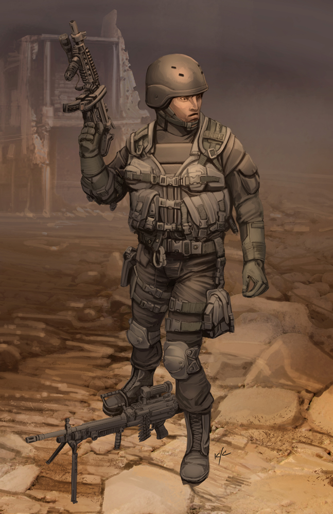
So, after another go at environments, I'm happy with this quick render background, now it's time to try some quick render characters...

Wednesday, February 1, 2012

Command Post Tundra


Or the Mushroom of Doom.

Let's get that lava worm abomination out of our heads, shall we?  Here's something much more along the lines of what I wanted to achieve with the last exercise, a much more naturalistic environment.  Uncomplicated, with a relatively muted color palette.  I also wanted to do something relatively quick, and spend no more than a day on it.  I'm not sure if that's the case or not, and my time was split up over a few days working on this, but I think it's for sure a day, no more than 10 hours.

I saved off WIP's as I went along, so you can see the development process for the size and shape of the structure, I'll get that up in a couple days...