Wednesday, November 26, 2008
Bond Week! 007
Here's the last one. The only Quantum of Solace background I had a chance to do, the Sewers of Siena. You can see there was a lot of work to get it from the test geometry to what the AD wanted to see, but it was a lot of fun. Again, tons of atmosphere and mysterious lighting to help sell the ideas.
I want to thank Manny Salazar at Treyarch for the opportunity to do these backgrounds, he was great to work with!
All right, that's is for me this week. I'm minutes away from leaving town to go eat Turkey!
Tuesday, November 25, 2008
Bond Week! 06
The rest of the White Mansion environments.
This is the Wine Cellar. Again it's not quite what I started with, but you can see it was pretty bare bones. Lots of mood lighting, a fun one to work on!
The Kitchen. Same ideas of modern meets rustic, the AD wanted me to try a cooler tone to the kitchen, to break it up a bit from the rest of the house, and it worked out pretty well.
This is the epitome of Rich Guy Douche. I like this one, I finally was getting warmed up to the whole process, and developing tricks and techniques to get faster and better. And then I was done, and on to robot making...
Monday, November 24, 2008
Bond Week! 05
Should have called it 'Week of Bond!"
Oh well. Back to White Mansion - the inside layouts, part one.
The foyer to the mansion. The idea was to go fairly modern, but try to retain some of the mood of the exterior architecture, so lots of wood, but glossy, and stonework on the shared indoor/outdoor walls.
Same idea, I introduced some marble to the flooring. I threw that fishtank in there, and the AD liked it a lot, and the design style became 'Rich Guy Douche' and so I started pushing that idea.
More of the same, a little obnoxious, yet still trying to hold on to some sophistication. This may have been the last one I did, I see I forgot to go back in and fix the ground reflections, whoops!
*Some of the geometry shots have some of the final work embedded, they were texture free at the time of the assignments, but to manage the layers, I just flattened those elements into the originals - in case anybody noticed!
Friday, November 21, 2008
Bond Week! 04
Haines Estate. Not sure where this one comes from, either Casino Royale or Quantum of Solace, but I don't really remember the set piece.
I did get a reference photo of the location, but unlike the White Mansion, I could control time of day, and the general mood of the environment, so it was a lot easier achieve a more satisfying piece. Building this one up from scratch using the reference, I could employ a lot more tricks and subtlety than having to show something in bright sunlight.
Another element to the assignment was to create some cover for 007 to sneak around, hence the trees, hedges, and brick walls...
Thursday, November 20, 2008
Bond Week! 03
From the White Mansion, I went to the barge and torture room levels. The torture room was pretty bare bones, but a major scene from Casino Royale, so I had plenty of reference. I mostly redressed the scene, and focused the lighting for gameplay.
The barge scene was a sniper element to the game, so the job here was to leave lots of dark spaces to hide targets, and again focus the lighting on the barge. Also I was asked to punch of the surroundings and create the overall look.
After I submitted the first pass, the AD and Game Designer asked me to do an alternate color of the lights on deck, and take off the walkway lights and insert targets with flashlights to provide the alternate lighting cues.
After the difficulties I had with the White Mansion, it was a bit of relief to do something a bit easier, focusing more on tweaking than creating.
Wednesday, November 19, 2008
Bond Week! 02
This was a rude awakening! After the relative ease of punching up a near finished shot...I got this to start with. It was hard, both because it was my first effort on the project, and technically, as it was a very complicated structure in bright daylight. I tweaked the lighting a lot, but it still seems toy like to me.
That house really exists, so I tried hard to match within the perspective of the shot, but man, it was tough. The greenhouse and back of the house was pretty easy to set up since I got to make it up myself. Still the colors were tough to get around. But then again, the art direction was to show ALL of it, but maybe if this was the last one it would have turned out better?
I still haven't had enough practice to know what to do, maybe develop some kind of distance blur/daylight atmosphere to make it more realistic. Of course, if it's all my own stuff, I doubt I would do a noontime shot...something to work on in the down time...
Tuesday, November 18, 2008
Bond Week!
I worked on the James Bond game earlier this year, doing concepts for backgrounds. Some were fairly simple, creating lighting cues and additional props over screenshots of nearly finished environments, to pretty involved, creating lighting and textures over very basic geometry, defining the gameplay.
I was working primarily on Casino Royale until I switched over to Transformers 2 full time, so I didn't get a chance to work on the car chase from Quantum of Solace, which was next on my to-do list...bummer!
I didn't really have much background-only artwork in my portfolio, so I was pretty excited to get an opportunity to stretch those creative muscles. And since I didn't have much BG's on the site, I agreed to do a test;
This is an expansion of the Miami Airport scene from CR, where 007 chases the bad guy around the terminal and hits the fire alarm. The background was nearly finished, but the art director wanted ideas for F/X and additional props to fill out the scene, and more defined lighting cues. I like how it turned out, but I think the fact I did it in about four hours seemed to get me the job!
*by the way, the papers on the ground are storyboards from the Hannah Montana DS game I was also working on at the time! Not that you can tell, but I didn't remember until just now!
That's right, all you seven fans have some Hannah Montana art to look forward to!
Monday, November 17, 2008
Saturday, November 15, 2008
Friday, November 14, 2008
Thursday, November 13, 2008
Wednesday, November 12, 2008
Vampire! Look out! pt. 2
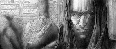
And here's the value pass for the drawing. I screwed it up with the marker colors...the lightest dark (if that makes sense at all) I had was a #5 - everything else was out of ink, so I used that.
Instead of doing the right thing and going to the store to get refills. Pfffft.
So I tried to push it back a little in photoshop, and leave the rest up to the pencils to pull out the detail.
Tuesday, November 11, 2008
Monday, November 10, 2008
Vampire! Look out! pt. 1
Friday, November 7, 2008
OZ - Sketches 13
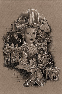
All right, here's the composition, all the elements put together. Now I'm going to do a value study, to both test the composition, and practice the characters one more time before I start the final. I need some sort of background element to tie it all together, probably going to be some sort of brick pattern....obviously?
Thursday, November 6, 2008
OZ - Sketches 12
Wednesday, November 5, 2008
OZ - Sketches 11
Tuesday, November 4, 2008
OZ - Sketches 10
Monday, November 3, 2008
OZ - Sketches 09
Saturday, November 1, 2008
Subscribe to:
Posts (Atom)