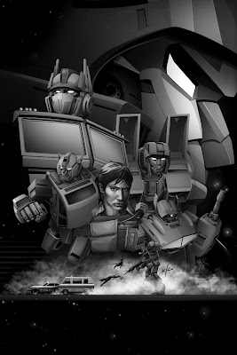
Wednesday, September 30, 2009

TF1 - Amblin

This is more of a story than an art post. So after a couple of weeks off, finally it was time to get started on the game. The deal had been made, Activision got the game, and Mr. Suarez asked me to be a contributor. Sweet!

There's a couple days in early January 2006, of fast and furiousness, a big all day summit meeting with all the developers for the various platforms, a couple of Hasbro guys, the Activision production team, and me. Then there was a trip to Amblin to read the script, and a trip to Bay's art production offices. And a bitchin' dinner at a place in Santa Monica.

This might not be the exact order of what happened, but this is for sure the first movie focused art I created. A special few were invited to Steven Spielberg's office, called Amblin on the Universal Lot, to read the final draft of the script. The main two producers for the old gen and next gen consoles, Suarez the executive producer from Activision, and crazily...me. Daniel had wanted me there to 'storyboard' the script. So we got put into a meeting room, which for anybody, would be the ULTIMATE den in anybody's home. It was glorious. The 'offices' of Amblin is actually a Spanish style mansion hidden behind thick trees, it really is a haven in every sense of the word. No Steven, but the coordinator gave us free lunch, and two hours to read the script. We each got a copy, with our individual names plastered watermark style on every page - there was no stealing this thing. The script was very close to what was shot, just less dumbass jokes, and a couple badass things that got left out. The best thing in the script was when Megatron finally got out of Hoover, and Starscream tells him that the cube got away, Megs bitchslaps him, before saying 'you've failed me yet again.' No slap in the movie though. One of many disappointments.

So while others read, and retyped/paraphrased the script, I drew like a muthaF'er for two hours...*


Notable - when Sam was falling off the building in the finale, time froze and he 'went' into the cube, and was given a history lesson by Sentinel Prime, about Cyberton's War, and the relationship with Prime and Megatron, and was given the clue to overcharge Megatron with the cube. So some of that was broken up and repurposed for the film, and the weird-o fantasy scene made it into the non-sensical sequel. You can see as I was running out of time...I wrote more than drew...

*The art wasn't posting with the correct size/proportions, so I broke it up and re-posted it.

Tuesday, September 29, 2009

TF1 - The beginning...

OK. Jump into the Way Back Machine to December, 2005. I had just spent the fall freelancing for Activision, helping them with the pitch to Dreamworks to get the next slew of animated movies locked down, working on Monsters vs. Aliens, Madagascar 2, Shrek Racing, How to Train a Dragon, and development for the Golden Compass. So I was nearing the end of Compass, and I got asked if I liked Transformers. Oh man.

I knew there was a lot of behind the scenes stuff trying to get a movie made, but I didn't know Spielberg was involved, or Bay was already locked down as director, or that production had finally actually started.


So I went to a meeting, and met with the team that was doing the development demo to try and get the game, and we discussed some game mechanics to get started. No one knew anything about the movie yet, so we kept it simple, and just created characters and worlds based on G1 reference. So simple combat story boards got drawn up, by me, featuring a land/air fight between Optimus and Starscream.


You can see an idea for transforming into combat was an idea that was intended waaaay back, unfortunately, Travelers Tales in the end couldn't pull it off - like the studs at Luxoflux could for the second game!


At the time, Megatron was rumored to be a tank, so we had a simple story written up, that I story boarded, featuring Prime vs. Megatron.


One last thing, they liked that last frame from the Meg vs. Prime sequence, and asked me to expanded to show Robot Gore...a take on battle damage.

Then I went on Christmas Break, and hoped they landed to project, for me to get started on in the new year...

Monday, September 28, 2009

Still digging...

Man, I did a lot more for that first game than I remembered..starting back in 2005! I should have enough set up to start posting by tomorrow - this two job thing is kicking my ass!

Here's a Megatron done by me, when I was maybe 10 or 11 years old. He's got a heat ray!


It's part of my first book, Autobot Frys. A seven page thrill ride, published 1985, in Mrs. Vanstone's Fourth Grade. Probably should have been spelled 'Fries' but maybe the adult helping me was an idiot. There's lots of misspellings that made it past the parental editor.

Friday, September 25, 2009

Transformers : the Game Concept Art...


...coming soon! I just need to dig out all the old stuff. I'm in the middle of getting assests ready to revamp my website, so some of the old characters from Transformers : the Game have been put into new images, all updated to include the final paint styles in how they appeared in the game and the toyline. Hopefully by Monday I'll have enough to get started with a new round of Transformers related posts...

Thursday, September 24, 2009

Junipurr.


A break in all the robot postings...this is a portrait I did for my wife, Keri, of her kitty we lost a few weeks ago. He was a super nice cat, and had what can only be described as MAGNIFICENT whiskers. His full name was Junipurr, but mostly went by Junie or JuneBug. Until he moved in with me, and gained many more nicknames...Joona, Noona, Nunie, JoonaBug, Noonabug (which spawned a song with a bass accompaniment) Fat Cat, (26 lbs. at one point!) Belly, Hoover, Yellow Cat, Coconut...

Wednesday, September 23, 2009

Transformers : Continuum Cover Detail


Here's just a detailed view of the little story within the picture. I'm always a big fan of the 'Soundwave Unleashing' pose, I was happy to be able to work it in. With the close-up you can see how little detail is actually in Ravage and Laserbeak. At certain points there was a light trail from the cassette hatch leading to the tapes, and they were shooting at Ratchet and Prowl, but when I did test prints at comic size, it was tough to read, and added a lot of clutter that wasn't necessary to tell the story....OK, now that's really that for that!

Tuesday, September 22, 2009

Transformers : Continuum Cover 04


Final! The original submission got rejected by Hasbro; I had a more 'rim-light' solution to separate the characters, but they wanted a more cloudy vignette, and they wanted me to add in Prime's shoulder. So by adding in the shoulder, it knocked the balance off, and since I was adding in the 'cloudy' atmosphere, I extended it out on the right side of Soundwave, to even it out. And a nice addition, it brought out Shockwave's gun hose a bit more.

So that's about it, comes out in November!

Monday, September 21, 2009

Transformers : Continuum Cover 03


As with the techniques I developed from the Dead End illustration and the original IDW pitch artwork, I did everything first in gray tones. It's a technique I've long know about, but never had success in bringing out the colors; some testing on my own, and some tips from my buddy, Adi, I finally got it all straightened out.

Another great perk of photoshop, is that I did the gray versions of each character on a separate layer, so when it came time to color, it would be a lot faster to just select each layer, and fill with the base color, and work from that starting point. Also to help with any adjustments in the compostition, pushing things around to tighten things up...

Friday, September 18, 2009

Transformers : Continuum Cover 02

I had to make a few changes. They wanted to see Bumblebee as a bot, not a vehicle, so he took Grimlock's spot and I slotted in Prowl in the vacant vehicle spot. I figured it would be cool to have the emergency vehicles with the light bars all glowing. Also, a note I got back...'Uh, Spike doesn't wear the hard hat in our series...he's like a SEAL now.' So I ran out* and got the first trade for the ALL HAIL MEGATRON series for Spike reference, drawn by Guido Guidi.

So, Guido, that's my version of your Spike in the image!


So after I submitted the thumbnails, and got feedback, I went ahead with the layouts. I was pretty firm on the composition, but still had doubts about the Megatron, and felt the eyes in the background was just too close to Darth Maul. I really liked the profile of Megatron, so I did these comps, one in the direction IDW wanted, and the way I felt would work better.


The sketch that had the original profile wasn't very strong, so I had to redo it, in a more compelling image. I think it made a better impression with this concept's iteration, and Andy was really cool about it, and agreed to let me move forward with this.


And this is the final pencils for the image.

*I know I claim to be a massive Transformers fan, but I admit to not following any particular comic series from IDW. Not that I never picked up any, I got some Milne comics because he's drawn some of my original characters, and others, like Spotlights, but I could never figure out where an ongoing series started or what. So it was kind of funny when Andy solved the mystery for me, and said that stuff hadn't really existed for them, that's the point to this Continuum book, to kick off the new ongoing series.

Thursday, September 17, 2009

Transformers : Continuum Cover 01

My first comic cover! Coming out in November. Here's the beginnings:

Andy Schmidt (also the writer of this book) at IDW said he wanted an 'epic' cover, in the style of Drew Struzan. I've had the good fortune to meet Drew a couple times, and buy some of his incredible artwork, so when Andy asked if I was familiar with his work - I was on board in a flash!

Drew is the King of Composition, so when I got my character list, I got started with these thumbnails. Prime, Megatron, Shockwave, Bumblebee, Ratchet, Starscream, Soundwave, Grimlock, and Spike were the characters I could choose from.


This is the first attempt, trying to get them all in there. Pretty quickly I got stuck on the idea to make Spike the central focus - since I was a kid, I viewed Spike as the audience 'connection' to the bots and their world. It was looking a little jumbled, so I pulled Megs out and made him more looming. Quickly I realized this was Darth Maul from the Phantom Menace poster - I wanted to emulate Drew, not copy him!


These are further explorations, breaking up the pile of heads that made up the first two ideas. One of the things I love about Drew's work is that sometimes he manages to tell a little story within the poster, so I got the idea of taking some of the characters, and making a little scene out of it. I sketched in Soundwave launching Lazerbeak and Ravage out after a speeding away Ratchet and Bumblebee. That also gave me room to expand the other characters past just head and shoulders, and open up the composition a bit more.


So the content was starting to fall into place, but that Ep1 Maul/Megatron was bugging me, so I did some alternatives, and landed on the idea for the profile of Megatron, rather than the looming eyes. Both distancing itself from a Drew rip-off composition, and actually creating more room to fit logos and other cover text that wasn't finalized, but need to be taken into consideration.

The other one was just simply another idea. I fancied the notion of the streaking Seekers in formation, but Starscream is pretty pivotal - I figured he would probably need to take a bigger role in the image.

So these got sent to IDW, to get feedback on a final layout...

Tuesday, September 15, 2009

TF2 - Dead End PSP 03


And here he is for final. I had conflicting reference for the final paint job, but I guess it's a departure from the actual toy after all, so not too big of a deal. I pretty much stayed with the toy detailing, but you can see where I filled in and added the car parts, here and there.

That back leg still looks a little wonky to me, but in the overall impact of the image, it's probably fine...but still, it bugs me. I struggled with it in the pencils, and you can see that the problems carried through - that was a pretty valuable lesson to me, to really put all the work in the pencils, and even then, it's ok to abandon that if it's not working, and start again from scratch. It's a lesson I still need reminding of, every once in a while.


As far as how he appears in the game - I don't have a PSP, but here's a character select screen shot from IGN, that just shows his head and shoulder area. Maybe that's all they used? Well, here's the rest of him, to you PSP players out there that have the game, and maybe haven't seen the full shot.

Monday, September 14, 2009

TF2 - Dead End PSP 02


After finishing up the pencils and sending them off to Hasbro for approval, I got to work on the grayscale. I approached this one a little differently than the drones in the console game, which I had finished about six weeks before. I was ramping up to do those G1 illustrations, so I was able to use this as a test piece to see if this new technique would work; doing the whole thing in gray, and coloring afterwards.

Again, the details I had to work with from the toy photos were pretty minimal, so I used a lot of made up details to fill-in the gaps, and by adding some more mechanical aspects, to bring it more into the movie-verse. In hindsight, I could have put even more mechanical parts in, but I only had a two week turnaround for this guy, and a week of it was lost waiting for approval on the pencils.

Friday, September 11, 2009

TF2 - Dead End PSP 01

But wait, there's more! After I finished up with the console game, Activision came back to me and asked for an illustration of Dead End for the Sony PSP game. They had been using all the marketing shots of the movie characters for Character Select, but they got to use Dead End as a character in the game. Since it was only a toy, they needed a movie style image of him to go with all the other characters.


This is a better picture than what I was given to work with! I post it here for reference to the character (Thanks Seibertron!) but much like the photos of the Soundwave toy I was given, they were very low res, with the fine detail not shown. So again, now that the toy is out, I see all the stuff I missed adding in to the final shot.


They needed an action pose to place in the Character Select, so I got to work with a bunch of sketches, and you can see #3 was the one I was pushing for, because...


...I thought it would be fun to recreate the original Dead End's pose from the original packaging illustration. Yes, I know I'm a G1 Extremist.


And so that got approved, and I went ahead with this final drawing.

Thursday, September 10, 2009

TF2 - DLC Optimus Prime 03


I forgot to add this to yesterday's post! The Gun of Prime. Same idea, traditional silhouette, with filled in details.

And that's it! You have seen just about all I contributed to the Revenge of the Fallen Game, done by Luxoflux. I know they have their system of development, but Activision had me work on the first game, and was keen to have me back for the second, and happily Luxoflux agreed to work with me to create all of these characters. I'm pretty proud of the overall work I did, and I think they made an outstanding game - I've played it all summer!

Primarily I worked with Justin Thomas and Joby Otero for the art designs, with Chris Tremmel contributing with the game design ideas to help form those concepts. And the producers I worked with, Brian, Marc, and Adrian helping me with schedule, paperwork, and legal design battles. They did a great job, and I wish to thank all of them.

And mostly I want to thank Daniel Suarez, Executive Producer at Activision, (responsible for the TF titles, plus other badass titles like the Call of Duty series) who has brought me into the Transformers universe, by asking me to do some storyboards way back in 2005, to pitch for rights to the first movie game - it has spiraled out of control ever since! And to extend my appreciation for having me come back for the sequels, and helping out with other Transformers titles and internal pitches for them.

Thank you, thank you, thank you!

Wednesday, September 9, 2009

TF2 - DLC Optimus Prime 02

The development of Prime was not as satisfying as Starscream, or even Megatron. I love the Starscream, and the differences of my Megatron, and the one that appears in the game aren't too drastic, but...Prime in the game is way too oversized, and not in a good way. Instead of coming across big and burly, which I think was the intention, he looks bloated with steroids. Instead of being ripped and huge like a pro wrestler, he looks puffy like home run 'King' Barry Bonds.


Again, trying to be faithful, the dotted sketch is the one I was wanting to go for...


...and this the one that we ended up with, after some arguments and revisions. It's just misproportioned, and I bummed with this is the representation. I had to really push the MP style, and that b.s. Revoltech toy, whereas I've said before, G1 toy and toon was my personal priority to draw reference from. That aside, and talk about the actual image, again I tried to keep the traditional transformation intact.


This is a revised version of what I had to turn in for final. The Transformation sequence shows that actual submission, but I went back and revised the design as best I could without totally redoing it. I gave him a longer torso, and slimmed and lengthened the upper legs, rescaled the head, and slimmed down and reduced the arms, trying to bring it all back to the origins. I just don't like the one I had to do, so this is the version that goes in the portfolio. The design pretty much follows the joint details of the MP toy, hydraulics and fairly exposed pivot points.


The back is a bit of a departure, but in keeping with the simplicity of the G1 transformation, I left the truck elements faily intact where I could, and the back reflects that in the lower lumbar area, and the hope was that it gave a bigger range of motion in the waist.


One of the things that kills me in that game is how far and peaked out the chest is, I reduced it back to keep the peak, but lose that massive overhang that somehow exists. Everything else is the same attempt to line up details in the side view, and fill in the gaps. You can see the socket for the shoulder, and all the joint details - that's all missing from the game. I don't know, but it could be the oversized shoulders that clip in and out of the body model that would have obscured it anyways, but whatever.

I was so burned about that Prime being the representation of me, and feeling that it was a missed oppotunity to get a faithful Prime on the market, and that led to my whole crusade to do these G1 illustrations to pitch to IDW and Hasbro. This version of Prime is essentially a redo of the game model, but doing it the way I felt was right. I added more curves, and changed to proportions around to bring more toon into it.

I'm interested to hear what people think of the game version, and if it even matters at all? I know I play the character all the time in the game, because the game is so much fun, and for all intents and purposes, it IS Optimus Prime. But I wonder if I'm too hyper-faithful to the origins, and am mistaken in feeling this was missed chance, and that the game skips some steps in giving fans not a true G1 representation, rather yet another 'G1-style' representation? OR, if it doesn't even matter at all, because it's not a toon shaded character?

Tuesday, September 8, 2009

TF2 - DLC Optimus Prime 01


Prime Time! This was an awesome assignment. The real Prime, as a real truck, with all the real world detailing I could fit. Again, looking to the toon and toy for inspiration, but also having the benefits of the real truck to work from as well. I kept it as close as possible to the real truck, and added in the Prime details where needed, like the yellow vents, etc. Gave him some mudflaps, and other tiny details.


I left the cab and drive train pretty much alone in the side view, but added some mass to the back of the cab, and the hitch area got a lot of beefing up to account for the leg mass. Put some branding on the tires, 'Primetime Shipping Co., Cybertron Autobot 84,' and a ton of nicks and scratches to punch up the battle weary warrior look.

Of course, in the game, there's no trailer, but I had blocked it out for approval before I found out. So after I was done with the project, I finished it for free - just in case they found they could use it. I couldn't leave him unfinished, and if anything, it's good for the portfolio!

Friday, September 4, 2009

TF2 - DLC Megatron


Megatron! As I did before, I started with the toon silhouette to define the shape, using both the show, and the Ark style guide. I did some slight variations, and settled on a similar take to the Starscream, Toon, plus a little more. After that is defined, I look to the toy for the primary details, and then fill in additional details and jointing from there.


Along with the G1 reference, I also grabbed some pics of an actual Walther P-38 gun, to help define some of the curvature and industrial design, and add a little real world nuance. The face, along with Starscream, is again broken up against the toon definitions - I went with the idea of how they animate puppet animatronics, with around six or eight pull points around the mouth, orientated in different angles, up into the cheeks, or along the jaw line. They seem to get a pretty good range of motion with that technique, so I thought (at least hypothetically) that it could apply here as well.


And like before, I tried to stay true in the front, and put all the exposed parts in the back. I added in some extra details to the back, just to punch him up a bit more, and give him the details that Starscram had. My plan was to do Starscream or Prime first, to set the standard, because I knew Megatron would need some help in the detail department.


This was one of the more successful side views, again because the simplicity of the design, it was easy to match up the lines from front to back. I tried to keep the complex detail contained to ease the creation of the side view. Of course, the brilliant original design helped a lot too!

As far as the game goes, I see he's a little puffier than this submission, which looks good on it's own, but I wanted to give the old school fans something original first, before getting away from that concept, and 'improving' it. Who knows, this could have been the only opportunity to do this, and as an insane G1 fan, I wanted to do something I wanted to see!

Of course, what I really want is to play a G1 toon game...!

And that's it for Megatron, at the time, I was not asked to do the gun version. They had no idea how to translate that transformation to the game with the engine they had. Had I known about special abilities, I would have suggested it for Starscream, but it looks like they were right on it, and that's how the gun mode appears in the game, and that's excellent. And the playable Megatron has a hover/flight mode as his Transform mode, and that's excellent too.

Thursday, September 3, 2009

TF2 - DLC Starscream 03


It's Starscream! So I was really happy about this guy, I thought he came out the best, sometimes the characters seem to transcend the almost clinical nature of these turnaround views, and still project some personality. Like I said before, I was asked to reference the MP versions (and annoyingly even the Revoltech versions) but aside from visible jointing and other small details like that, I kept it G1 toy and toon as much as possible.*

With the joints, which I don't think was built into the game versions, I at least intended to have the boxy look, but with sliding panels to accomodate range of motion. I.E., the shoulder would be capped by the top of the 'box,' but the cap would attached to the rotator, and slide into the recess of the side of the shoulder as the arm was raised. Make any sense? It's a simple engineering concept, like a breadbox or a rolltop desk. But everywhere around the major joints. Made out of armored metal.


While trying to maintain the look, I knew I had some sacrifices to make, so I went with the idea of keeping the front true to the old designs as possible, and putting the functionality in the back, especially with the elbows and knees. So that's why you see more exposed gearing.


Again, the side view is more of a pickle to deal with, trying to reconcile the details from the front and back. I tried to keep it as true as possible, but I think a few changes had to happen to get things to line up.

Hopefully not too much of a big deal, because overall I thought he came out great...and I finally got to play him last night, and it was super fun! Using Megatron as the Special Ability weapon? Badass.

*I already saw on the boards someone dinged me for the orientation of the wing symbols! Like I said, I used a mix of G1 toy and toon to define this guy, the toon has upside down symbols, the toy didn't. Whether or not one version has lived on more than the other, I can't really say, but I can say I tried as hard as possible to stick to 1984 to a fault.

Of course, if someone really thinks this character is horrible and ruined because of this, please direct all blame to me. I can take it.

Wednesday, September 2, 2009

TF2 - DLC Starscream 02


Vehicle mode for Starscream. This was a joy to do. Aside from the scrapes (originally I turned him in wothout, but Luxo requested it) I thought it was great to see a fairly real world interpretation of the Transformers F-15. The MP toy is very close, so my interpretation is a mix of that and the real jet.

It's tough to pull off the bright, primary colors in a real world setting, so I dropped the saturation down, and pushed the textures to bring it a bit more into reality.


Same with the side view, but I deviated a bit from the MP toy, and made it more like the G1 figure, in regards to the feet. Aerodynamically, it's probably terrible...but this is Starscream! He can fly faster than anybody else!

I did two versions of the gun/null ray. The G1 toy, with the firing missile caps, and the toon verision, with the long barrels. I made them .50 cal barrels for the jet mode, but they transform into the more stylistic blasters in robot mode.


This is just a 'sticker sheet' of graphics for the Luxo guys to just for model textures. A little more GI Joe than Transformers, but it gets the job done!

Tuesday, September 1, 2009

TF2 - DLC Starscream 01

Okay, after I had finished the game, Luxo came back to me with the group of DLC characters they wanted to do, the afore-posted Soundwave, and G1 versions of Prime, Megatron, and Starscream. They were a little hazy on what they themselves meant by 'G1' and it took awhile to get some clear answers. At first I thought they meant movie-style G1 characters, and then when I asked if it was cartoon based G1 characters (which, c'mon...that's what G1 MEANS, doesn't it?) they said, kind of...but more detailed...

Then they referenced the MP style toys, and I finally got the idea. But, myself being a traditionalist, I fought as hard as I could to maintain the cartoon aesthetics, because as a fan, that's what I both wanted to see, and play. So while I was trying to puzzle out what they wanted, I did this range of designs, going from toon, to blown out overdone movie style.

After some discussion, it was somewhere in between the second and third choices, keeping the G1 silhouette, and breaking up the planes with detail and depth. Awesome with me, so I took that design sense into the rest of the body.


These are some variations of the G1 outline, but honestly I wanted to be true-blue-100% to the toon version, so the changes are pretty minor.


Obviously, Luxo could just look to the toon's to keyframe the transform, but I wanted to double make sure, so I continued supplying them with these instuctions...